
What’s goin’ on?
I feel like we’re finally getting to the bottom of this. We’re starting to look at things in a new way and really trying to focus on positives. We’ve spent enough time focusing on the negatives.
Emerging Positive Narrative Amidst Market Negativity
It’s been a long time since we’ve seen a positive narrative in the markets. Coming out of COVID, it’s been a never-ending stream of negativity. If it wasn’t a new strain of COVID, it was a new war breaking out or that mystical, phantom inflation that crept its way into our economy at exactly the wrong time. Pick your headline; it’s been nearly three years of one thing after another.
All year, we’ve been discussing trend change and the opportunities that present themselves while this process plays out. We’ve considered and reviewed the different aspects of how Wall Street uses all the resources available to them as they execute their strategy. Last month, we presented the motivation behind some of the tactics deployed during trend change and their goals during these periods. Scaring retail investors into selling at the bottom and keeping them out of the trade until they’re ready to begin taking profit sums it up nicely.
Inflation and Interest Rate Impact on Sectors
Over the past several months, we’ve also been discussing the sectors of the market most impacted by the inflation/interest rate hike mania. We’ve reviewed several sectors and presented multiple individual stocks that have seen massive accumulation. Last month, we looked at the presence of wild price swings even on good earnings news. We recognized this as a sign that trend change may be coming to a conclusion, as this type of price behavior is typically seen late in the cycle.

Transitioning to the Next Phase of the Institutional Business Cycle
This month, we’re closely examining evidence of what we believe is a transition into the next phase of the institutional business cycle. We’ll take an in-depth look at one of the sectors most affected by the interest rate hiking period and review several individual stocks for potential opportunities.
Trade Therapy focuses on changing how our members think about the markets and manage their investments. Over the past several months, we’ve presented the goals of financial institutions at the bottom of their business cycle when markets are oversold. Understanding their goals makes it easier to hold or add to your positions despite never-ending, seemingly detrimental news headlines. When you know Wall Street is buying, the scary “Breaking News!” isn’t as scary as it once was. This is what we mean by behavioral change.
Adapting to Changing Narratives
As the narrative changes, institutional motivations shift, and the narrative adapts to suit them. In February’s edition of “From The Trading Couch” entitled ‘More rate hikes? Really?’, we suggested:
“The ‘hyper-inflation = hyper rate hike’ market hysteria is likely in its final stage. We continue to see dramatic downside moves in higher beta assets, signaling trend change. These wild price swings are designed to trigger stop losses and push retail traders out of their positions. Institutional money is accumulating positions and preparing for their markup campaigns. A markup campaign is essentially an uptrend, where investment firms hold full positions acquired during oversold conditions. These conditions typically arise during periods of panic fueled by alarming headlines. Once firms have a full inventory, they initiate a coordinated campaign to move prices up, including price management, social marketing, favorable analyst opinions, and a positive narrative. Headlines shift from scary to hopeful, drawing investors into the upward momentum.”
Exciting Times Ahead
Indeed, as the institutional business cycle turns the corner and begins a new markup campaign, it can be an exciting time to be in the market. It’s even more exciting if you’re entering that period with full positions alongside Wall Street as they flex their resource muscles and kick off the new uptrend.

Followers on social media may have noticed us sharing this headline when it came out last week. This is the first time we’ve seen the narrative beginning to change. Just like the wild swings in price behavior we’ve been seeing for several months, when the storylines begin to shift is when we know it’s time to start looking for signs the business cycle is beginning to change.
Market Sectors and Yield Curve Inversion
The sectors of the market that have been pushed to extremes in both directions should be showing clear signs of weakening and/or reversal. Earlier this year, we discussed the significance of the yield curve and what it means when it becomes inverted. The post-COVID market has experienced the longest yield curve inversion on record, surpassing even the late 1970s’ economic challenges. Unlike the 70s, we don’t face oil embargoes or stagflation. Instead, massive government stimulus flooded the market, fueling the meme stock craze and drawing in lockdown money. Now, post-COVID inflation hysteria is the perfect setup for Wall Street to extract those gains.
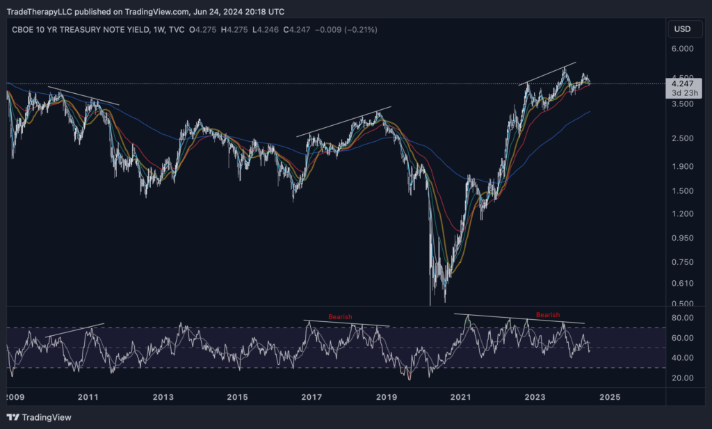
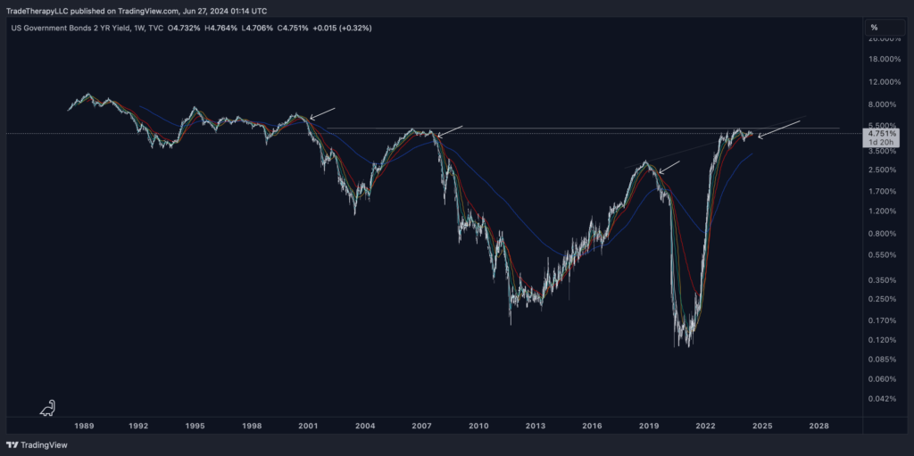
Analyzing the 10-Year Treasury Note Yield Index (TNX)
Above, we see a long-term view of a weekly chart of the 10Y Treasury Note Yield Index (TNX) with clear, long-term relative strength index (RSI) bearish divergence. This chart is the main reason the yield curve is inverted. It’s important as it’s widely scrutinized and is the basis for things like mortgage rates, corporate bonds, and other types of loans. Notice the head and shoulders forming. Those of you who have been reading up on Wyckoff might see a buying climax followed by an upthrust after distribution. Or, if you’ve been studying Elliott Wave Theory, you might notice the corrective wave forming. These are classic patterns and obvious reversal signals. Here’s another look.
Technical Patterns and Yield Curve Manipulation
Members that have been familiarizing themselves with the technical theories and setups should see the topping pattern forming. The zoomed-in view (lower left) shows the lower-term moving averages crossing over the higher-term ones, with the price currently sitting below the 30-week simple moving average (30WSMA, gold). Take note of the previous cycles where the price loses the 30WSMA.
All of this is pretty technical and can be a little confusing. What this essentially shows is how the interest rate-sensitive sectors of the markets have been held down for so long. Wall Street has pushed 10Y Treasuries down and inflated yields in an effort to replicate the look of a recession. Pending doom. An inverted yield curve and this sharp, rising TNX chart provide exactly what every blogger and writer covering the markets needs to pump FUD all day, every day—which is exactly what they’ve done.
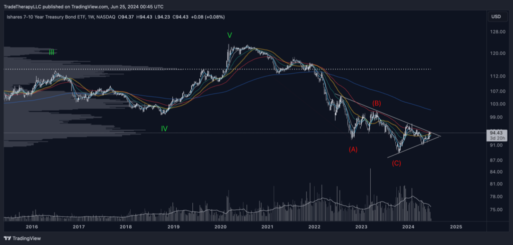
Institutional Accumulation in Treasury Bonds Signals Market Shift
TNX is the yield index on 10Y Treasuries. This is the chart for the 7-10Y Treasury bond ETF (IEF). It really shouldn’t be too surprising to find institutional accumulation happening in IEF. Here we find the all-too-familiar institutional accumulation pattern we’ve seen in all the interest rate-sensitive areas of the market. As we just discussed, fear and uncertainty about interest rates push yields up and bond prices down. So, the ‘higher for longer!’ or ‘more rate hikes are a strong possibility’ rhetoric suppresses prices in interest rate-sensitive areas. Remember, the institutional business cycle is to acquire positions during oversold conditions.
This symmetrical triangle pattern at the end of a long, corrective wave is a strong reversal signal. The institutional accumulation pattern that has formed with the massive volume (bottom of the screen) tells us all we need to know. Though there may be a false breakdown in a final effort to find liquidity, this is a very bullish look.
We’ve spent a lot of time on Treasuries as they’re indicative of the turning trend and the beginning of the next stage for the institutional business cycle. Accumulation cycles appear to be completing, and the emerging new uptrend looks to be gaining momentum.
How is this affecting the things?
I don’t want to get too excited, but I think I can see the light at the end of the tunnel. We might just make it through this.
So far, we’ve focused on gathering evidence of the changing institutional business cycle. If we see Treasury yields fall, the downward pressure that has remained on equities for the past few years will release. All year, we’ve been discussing the extended accumulation phases we’re witnessing in the interest rate-sensitive sectors of the market. Releasing the downward pressure on these sectors should catapult them out of the range-bound condition they’ve been in for the last few years.
Before we give the all-clear, we need to look for additional evidence that institutional activity is pointing toward monetary policy change. The catalyst for the drop in yields will be changes or expected changes to current interest rates. Uncertainty produces high yields.
Generational Accumulation in 20Y Treasury Bonds
Earlier this year, we looked at the 20Y Treasury Bond ETF (TLT) and how the inversion of the yield has led to lower prices. We’re seeing generational accumulation in TLT. As a change in monetary policy approaches, we expect to see obvious signs that the downtrend in interest rate-sensitive sectors, such as 20Y Treasuries, is favoring reversal.
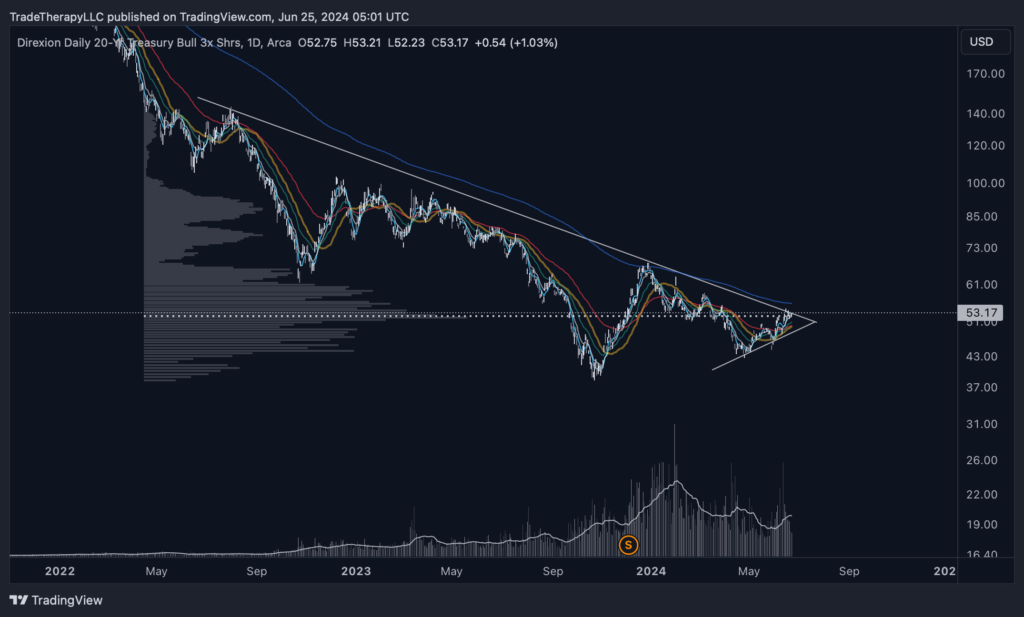
This is the weekly chart for the 20Y Treasury Bond Bull 3x ETF (TMF), a leveraged fund that magnifies the movements of TLT. It has formed a symmetrical triangle similar to the IEF chart shared earlier and the chart for TLT that we shared in March. If bonds and yields are showing signs of reversals, we should be able to find more examples for confirmation.
Recessionary Headlines Versus Economic Reality
Headlines will most likely point to these periods as recessionary. However, as we previously discussed, we’re not seeing any signs of recession. In fact, as we’ve been covering all year long, we’re seeing a robust, strong economy that is being represented as a poor one. Why? Because when interest rates come down, the high beta sectors will rise again, and guess who’s been buying up massive inventories of them.
Indicators of a ‘Fed Pivot’ and Monetary Policy Change
All of this points to a ‘Fed Pivot’ and monetary policy change. Those who have waited out the pullback (not our recommendation) holding individual stocks should be enthusiastically watching these charts and not reading the headlines. The word ‘inflation’ will be used over 100 times in tonight’s debate. All of the interest rate-sensitive charts are showing institutional accumulation. This all points to big things to come for these sectors. We’ll take a closer look at the leading Biotech ETF (XBI) after we take a look at the final piece of evidence pointing to breakouts in these sectors, the monthly US Dollar Index.
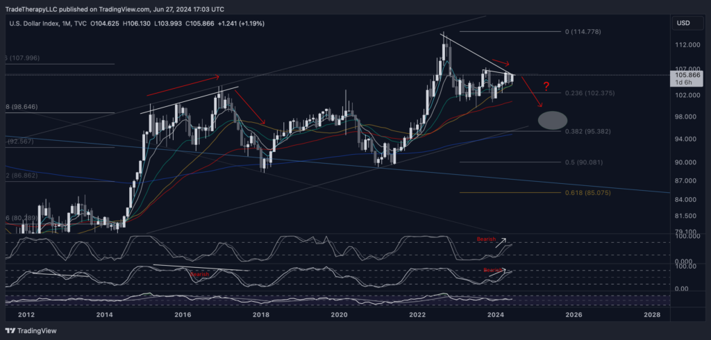
This is the strongest downward pressure we’ve seen on the USD since Jan.’17. This is probably the strongest indication here. This is a monthly chart. Resistance like this is considered to be very strong. There is massive downward pressure on the USD. It weakens as interest rates decline. Risk assets trade inversely to the USD. One of the industries most impacted by a strong USD is Biotech.
What can we work with?
I feel like we’re at the point of a possible breakthrough. The issues we’ve been facing all seem to be improving.
Signs of a Bullish Setup
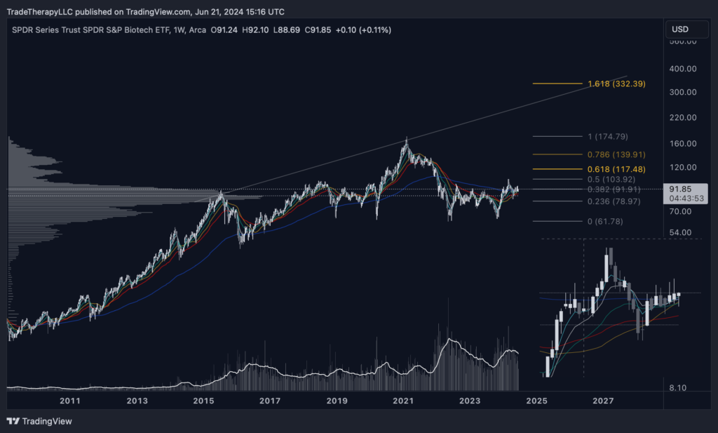
Heading into the release of the Personal Consumption Expenditures Price Index (PCE), XBI is ‘bull flagging’ at the top of a 2.5-year accumulation base. It has built a massive, institutional support base at this level. It has cycled through the institutional business cycle and is ready to move to the next stage.
XBI is showing price exploration above its resistance with long wick candles over the past 8 weeks. This indicates professional money creating the path of least resistance, a concept familiar to readers of FTTC. For those who haven’t, begin studying the work of Jesse Livermore. He would have loved this setup as low float, tightly held assets were what earned him the nickname “the boy plunger.” However, in this environment, he wouldn’t be short.
Awaiting Follow-Through
This is a very bullish setup, but it needs follow-through. Whether tomorrow’s PCE numbers are the catalyst or not, this markup campaign appears imminent and should last for the medium-long term. This is a major shift in policy that is extremely late. These excessive requirements for the Fed to see more evidence have created an explosive setup for XBI.
Final Look at XBI: Bull Flag at Previous Supply Zone
Last look at XBI (weekly) shows a bull flag developed at the previous supply zone. This chart details the transition of resistance to support as the prior supply zone has been converted to a demand zone.
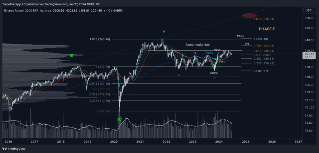
Notice the institutional volume levels. After working its way through the overhead supply left over from retail buying the top again, IWM should extend to higher targets over the next several years. When you see the charts from individual stocks represented in the overall index they’re a part of, it’s a very strong signal. Only something catastrophic (black swan event) will derail this setup in our opinion.
Political and Market Volatility Considerations
It’s important to note, as bullish as all the evidence compiled and presented above, we are in the middle of the Presidential race. It is possible for this setup to backtest and/or see a period of continuation. It’s been in this pattern all year. Of course, continuation for another month or so wouldn’t be cause for alarm. Just a delay of the inevitable based on all the data in charts in front of us.
When the trend changes this dramatically, violent price volatility should be expected. You should have a shopping list together. It’s time to compare their charts with the charts you’re seeing here. If you’re unsure of whether your holding is sensitive to interest rates, run a ratio chart for your $ticker/TNX. This will show you what should be pretty obvious.
Next Steps: Individual Stock Case Studies
Before looking at a couple of individual stock case studies, here’s what XBI/TNX looks like.
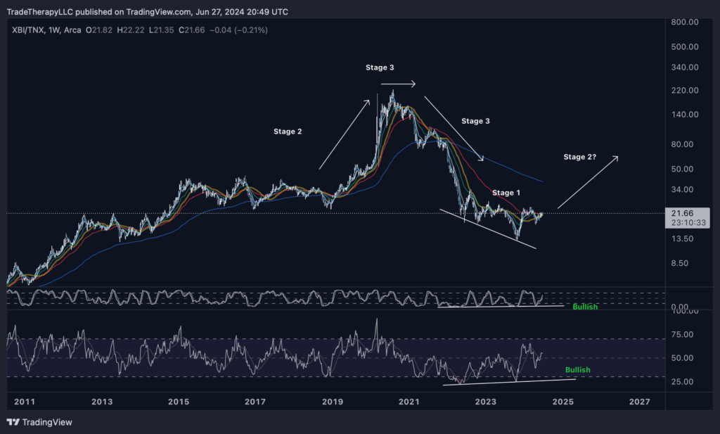
Additional Evidence: Inverse Head and Shoulders Pattern
As if we needed more evidence, notice the inverse head and shoulders pattern. This is the worst period XBI has ever had compared to interest rates. Not surprising considering this is the longest inverted yield curve period on record.
Case Study: Crispr Therapeutics (CRSP)
CRSP is in line with other interest rate-sensitive stocks though not represented in XBI. It is one of Cathie Wood’s favorites from the genome space. CRSP represents >7.7% of ARKK and ARKG each.
CRSP has formed an almost identical chart to the ones covered throughout this issue. Again, it’s a textbook example of Wyckoff’s ‘creek’ concept. We favor a bullish outlook here as CRSP moves out of this accumulation range and into phase E, setting a series of ‘Signs of Strength’. Trading it off the lower term WEMAs will most likely continue to provide favorable risk/reward setups.
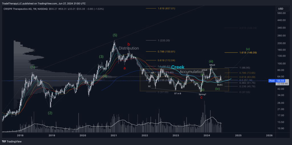
Bullish Scenario (Primary Expectation): Though unable to hold its moving average cluster, CRSP has found support at the local .382 Fibonacci level coinciding with the ‘edge of the creek’. These backups take out the pricing inefficiency of the ‘jump across the creek’ (long white candles) in November 2023. Buyers come in, and wave 3 of the initial impulsive structure begins.
Bearish Scenario: The WEMAs become resistance and a larger, corrective wave 2 develops. Supply is reintroduced, and price backtests the low, continuing the accumulation period in a range-bound condition.
Case Study: Twist Biosciences Corp. (TWST)
A top 3 holding of XBI and in a slightly more mature breakout of its accumulation structure. If you look closely at the previous chart, you’ll see a very light box (Darvas box). The breakout we’re expecting there, coming out of the upper right corner, has already occurred with TWST. We’re seeing a high, bull flag developing, already showing the transition to a demand > supply condition.
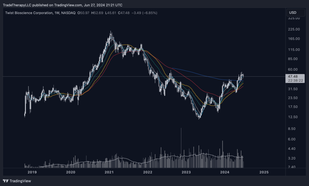
Bullish scenario: (primary expectation) Our expectation for the performance in CRSP is present here. Notice the recent retest of the 30WSMA (gold) initially failed then came back to reclaim it on it’s way to set another SoS.
Bearish scenario: The short position from Aug.’22 peak is still present until it’s taken out. Supply is dumped back onto the market and the next lower support levels are tested in the $42s.
It’s an exciting time to be in the market. Trend change presents incredible ROI opportunities. We hope you’re taking advantage of our insights while practicing responsible risk management. Use stops below moving average clusters. They’re everywhere.
Disclaimer: Trade Therapy, L.L.C. content is intended for US recipients only and is not directed at UK recipients. Our information and analysis do not constitute an offer or solicitation to buy any security and are not intended as investment advice. Content should be used alongside thorough due diligence and other sources. Opinions and analyses are those of the author at the time of publication and may change without notice. Trade Therapy, L.L.C. and its employees may move in or out of any trades detailed within our content at any time at their discretion. Employees and affiliates of companies mentioned may be customers of Trade Therapy, L.L.C. We strive for transparency and independence, and we believe our material does not present a conflict of interest. All content is for educational purposes only.
Leave a Comment
You must be logged in to post a comment.