

September delivered what traders had been begging for: interest rate cuts. After years of restrictive policy, the pivot finally arrived. But the timing could not be more treacherous. Cuts have landed right in the middle of volatility season, when markets are prone to sharp swings, thin liquidity, and emotional trading.
To the casual observer, the pivot feels like rescue. But to professionals, it looks more like the eye of the storm — a pocket of calm surrounded by turbulence on all sides. Volatility has not disappeared, it has simply shifted shape.
This month, we are looking at how institutions are navigating that storm. From the behavior of small caps and financials, to the reawakening of emerging markets, to the stress tests still visible in innovation names, the message is consistent: rate cuts may set the stage for the next markup, but the path forward will not be linear. The storm hasn’t passed. We are standing in its calm center.
Institutional Business Cycle – The Eye of the Storm
“I thought rate cuts were supposed to fix this. Why does it still feel like every bounce gets sold and every dip looks dangerous?”
That’s the frustration of September. The pivot is here, yet price action feels anything but straightforward. Institutions are not celebrating the cut, they are using it. After years of policy pressure, the first easing move gives them cover to reset campaigns — trimming where profits are stretched, testing demand in lagging groups, and recycling capital into the bases quietly built during the tightening cycle.
The evidence is everywhere. Small caps, the most interest rate–sensitive of the majors, have finally caught a bid but remain pinned beneath supply. That isn’t failure, it’s deliberate stress-testing. Institutions are probing liquidity, making sure the demand zones carved out through 2022–2024 can support new flows before committing to fresh markup.
Meanwhile, leadership in the megacaps has shown signs of fatigue. Narrow breadth and rotational chop tell us that capital isn’t vanishing, it’s being rationed. Wall Street is harvesting from extended campaigns and shifting exposure toward late bloomers. This is how institutions turn the calm into an opportunity: exploit the cover of “good news,” recycle risk, and prepare the market for the next sustained move once the season of volatility has passed.
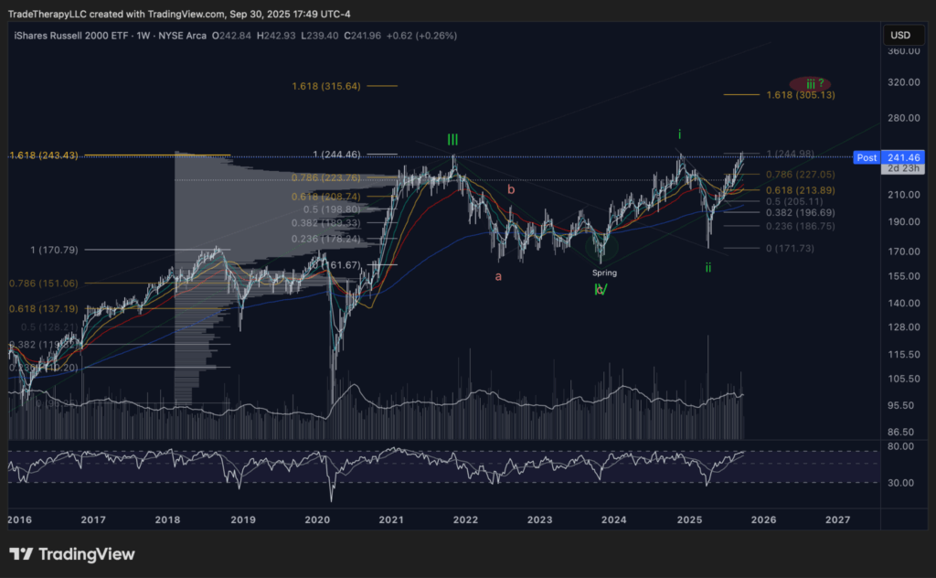
📊 Chart 1 – IWM (September 2025): From Stress Test to Extension Setup
What looked like another frustrating summer backtest has now confirmed itself as the proving ground for rate-sensitive equities. In August, small caps were pinned beneath resistance, their strength questioned while liquidity was rationed. September has shifted that picture. Institutions defended the spring, reclaimed moving averages, and are now pressing directly into the top of the multi-year range.
This is exactly how institutions operate in the eye of the storm. They use the calm to test whether demand is real, not manufactured. The annotated roadmap shows it clearly: the Wyckoff spring of 2024, the measured higher low of 2025, and now the controlled challenge of overhead supply. Fib clusters around $243–$244 act as the first hurdle, but the real signal is whether demand carries price into the 1.618 extension near $305.
What retail sees as “stalled” action at the highs is actually institutions rationing capital, probing liquidity one layer at a time. If this range resolves, small caps confirm themselves as the next carrier of the cycle. If not, institutions have already stress-tested demand zones and know exactly where to reload. Either way, IWM has graduated from being the laggard to being the laboratory — the index where Wall Street determines whether September’s calm can hold when the winds pick back up.
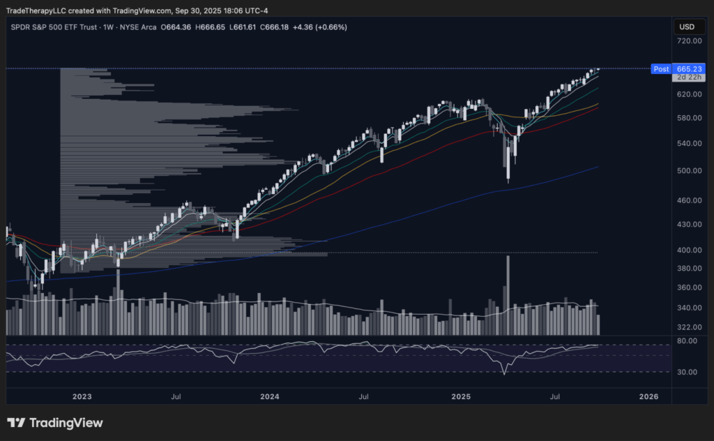
📊 Chart 2 – SPY (September 2025): Calm Tape, Controlled Campaigns
At first glance, SPY looks untouchable. Weekly closes press steadily into new highs, EMAs remain bullishly aligned, and volatility has collapsed from the violent flush earlier this year. To retail, this feels like the all-clear. To institutions, it’s the perfect mask.
SPY’s resilience is not about broad enthusiasm — it’s about capital management. Institutions are using the index as the ballast for portfolios while trimming overstretched winners and probing for new leadership elsewhere. Volume tells the story: rallies are not expanding on a surge of demand, they are gliding higher on compressed liquidity. That is the signature of a managed campaign, not a speculative melt-up.
This is why SPY feels so deceptive in September’s calm. Beneath the surface, breadth has narrowed and small caps are carrying the stress test. But on the surface, the tape looks serene. This is how the eye of the storm is engineered: keep the flagship index steady, let retail believe the danger has passed, and quietly rotate exposure into the groups that will drive the next leg when volatility inevitably returns.
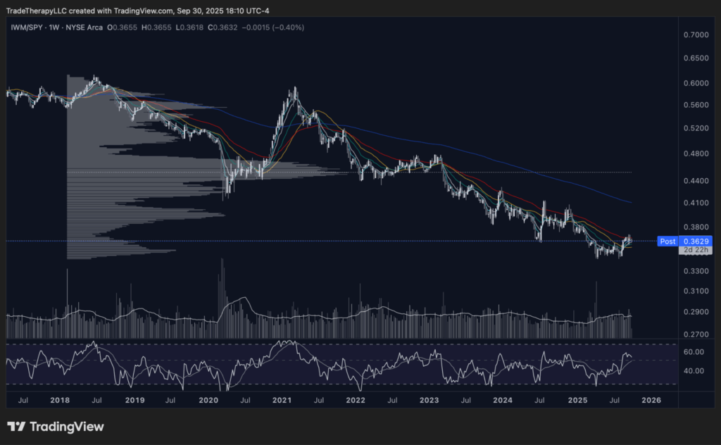
📊 Chart 3 – IWM/SPY (September 2025): Echoes of the COVID Bottom
The IWM/SPY ratio is quietly showing one of the most important tells of this cycle. After years of underperformance, small caps have carved out a bottoming structure strikingly similar to the pattern formed at the COVID lows. In both cases, prolonged decline gave way to a base, EMAs began to flatten, and momentum started to turn just as institutions leaned into discounted risk.
This is no accident. Ratios like IWM/SPY reveal how capital rotates beneath the surface. During the pandemic shock, institutions accumulated small caps aggressively while headlines screamed collapse. Today, with the first rate cut arriving into volatility season, the setup is nearly identical: retail is skeptical, but the ratio is signaling accumulation.
The eye of the storm is exactly where this kind of rotation begins. Large caps like SPY anchor the surface, but the real asymmetry builds in the laggards. Institutions are not waiting for retail to believe in small caps again. They’re already seeding exposure, letting the ratio quietly shift before the next leg of markup carries breadth higher.
💡 Cycle Mechanics: Calm as Rotation Cover
What looks like serenity in SPY masks the rotation beneath it. IWM’s breakout tests and the IWM/SPY ratio’s bottoming echo of 2020 both confirm the same point: institutions are using September’s calm to reweight risk. They are not chasing; they are repositioning. For traders, the lesson is to look past the surface calm and focus on where liquidity is quietly turning — because those rotations decide who leads once the storm resumes.
Monetary Policy – Reading the Curve
“The Fed finally cut. Shouldn’t that mean bonds rally across the board? Why does the short end still look hesitant?”
That’s the paradox of September. Rate cuts are supposed to feel like shelter from the storm. Instead, they expose how institutions treat policy as cover. The curve tells the story: professionals aren’t chasing across all durations. They’re pacing exposure, testing demand in the short end, and waiting for confirmation before unleashing long-duration campaigns. The calm feels uneven because it is engineered that way.
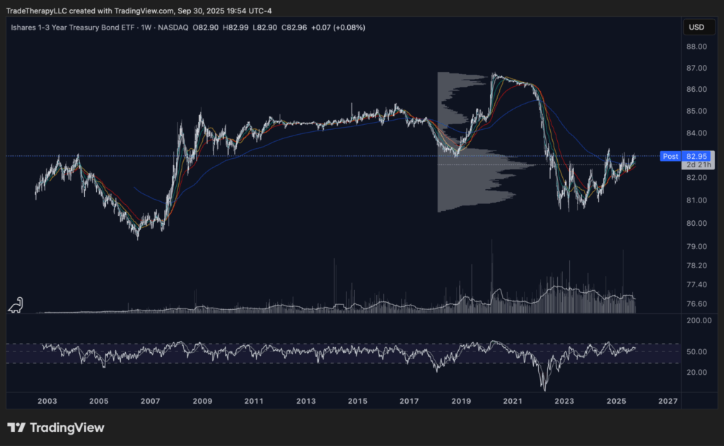
📊 Chart 4 – SHY (September 2025): Short-End Scar, Late-Stage Accumulation
The iShares 1–3 Year Treasury Bond ETF (SHY) sits at the front of the curve, directly reflecting Fed credibility. Its weekly chart is striking. The 2022–2023 collapse, driven by the “inflation isn’t transitory” panic, dwarfed even the Great Financial Crisis — a historic markdown engineered under the cover of hawkish rhetoric.
That flush left scars, but it also left a range. SHY has been building a textbook late-stage accumulation base ever since. Institutions have quietly absorbed supply while headlines kept retail fearful of more tightening. Now, with the pivot finally here, SHY is perched at its all-time pivot zone. A sustained break higher would confirm that the short end has transitioned from policy trauma into markup.
The significance isn’t just about short Treasuries. SHY is the canary for the entire curve. If the front end can clear its scar and extend, it signals that institutions are ready to press duration out the curve. If it stalls, then September’s calm is just another pause inside the storm.
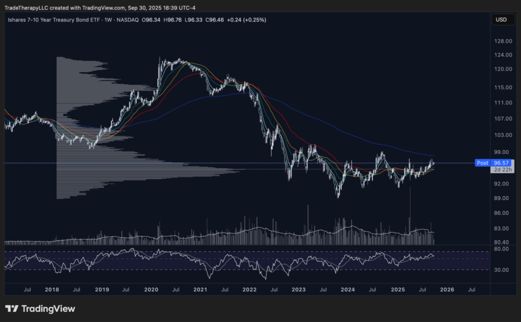
📊 Chart 5 – IEF (September 2025): Mid-Curve Test of Policy Relief
The iShares 7–10 Year Treasury Bond ETF (IEF) sits in the belly of the curve. It’s where institutions balance duration risk with liquidity, long enough to capture policy direction, short enough to remain flexible. That makes IEF the benchmark for testing whether a pivot has real traction.
The chart shows why this moment matters. After years of relentless markdown, IEF has built a wide base and is now pressing against its 200-week EMA. Each rally has stalled at this line, showing that institutions are not yet willing to declare the storm over. They’re leaning into demand, but keeping supply in check until cuts prove durable.
This is the essence of institutional risk management in the eye of the storm. The belly of the curve is not about chasing return; it’s about measuring credibility. If IEF clears its ceiling, it signals that policy easing is more than a headline. If it stalls again, the message is clear: institutions will wait, ration capital, and let retail trade the noise.
💡 Institutional Literacy: Reading the Curve
Rate cuts don’t unlock a one-way rally. They shift how risk is managed across maturities. SHY reveals the Fed’s credibility — the scar left by “inflation isn’t transitory” still shapes the front end. IEF tests whether easing has staying power. TLT holds the asymmetry for the next major campaign, but only if the short and mid-curve confirm first.
For institutions, this sequencing is everything. They don’t trade the headline; they trade the curve. The calm you see today isn’t resolution. It’s the careful rotation of risk from short to long, paced so the next markup campaign launches only when the structure is ready.
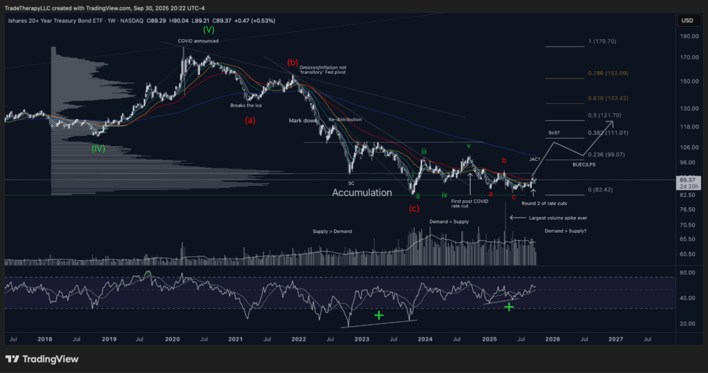
📊 Chart 6 – TLT (September 2025): Long-End Asymmetry Emerging
The iShares 20+ Year Treasury Bond ETF (TLT) is where institutions seek real asymmetry. Long duration magnifies the impact of easing cycles, but only after deep bases have cleared. That makes TLT the final step in the curve, the place where campaigns turn from cautious hedging into full markup.
The chart shows the story in stages. The “inflation not transitory” pivot produced the steepest markdown in TLT’s history and it dwarfed prior drawdowns. That collapse forced capitulation, but it also set the stage for record absorption. Volume surged through 2022 and 2023 as institutions quietly built positions while headlines stayed locked on inflation and deficit fears.
Now the structure has matured. The spring in 2023 was defended, higher lows have formed, and the second round of rate cuts provides the catalyst. The largest volume spike on record at the base confirms institutional commitment. With the first signs of a Sign of Strength already visible, the roadmap is clear: reclaiming the 200-week EMA near 101.3 would validate the base and open the door toward fib targets at 111, 133, and eventually 152.
For retail this looks like a messy recovery. For institutions it is the final phase of accumulation, a late-stage setup with explosive potential once policy credibility filters through the curve. TLT is not just a bond ETF, it is the litmus test for whether the easing cycle is real.
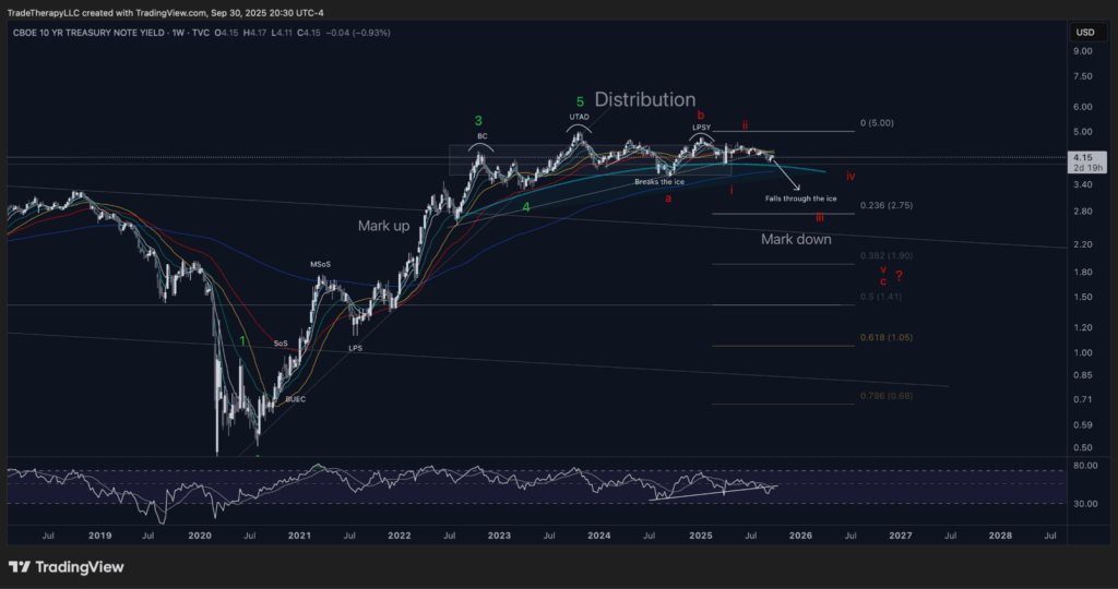
📊 Chart 7 – TNX (September 2025): Yields Rolling Over After Distribution
The 10-year yield (TNX) gives us the mirror image of the bond ETFs. After a multi-year markup that peaked with the “inflation not transitory” panic, the chart now shows a textbook distribution. The upthrust after distribution (UTAD) in 2023 cleared remaining shorts, the last point of supply (LPSY) confirmed, and yields have been breaking down since.
September’s tape adds critical detail. TNX has tested its falling moving averages from below and is now rejecting the 9-week EMA. Momentum confirms the weakness: RSI has lost its pivot from last month and backtested it from underneath, a bearish tell. For institutions, this is validation that the distribution phase is complete and the markdown is underway.
The implication is simple. Retail hears “yields sticky” and fears inflation. Institutions see a completed distribution, engineered tests, and confirmation that bonds have transitioned out of policy trauma and into recovery campaigns.
📌 What This Means To You
Yields are not staying high because policy is failing. They are rolling over because distribution is ending. SHY shows scars at the short end, IEF proves whether easing sticks, TLT holds the asymmetric setup, and TNX completes the picture by confirming that the storm has shifted. For traders, this means the calm is not an all-clear. It is the phase where institutions quietly move out of distribution assets and into accumulation bases that will drive the next markup.
Supply vs Demand – Rotation Beneath the Calm
“Breakouts look strong, but what happens when the next squall hits? How do I know which ones hold and which ones fold?”
That is the tension inside September’s calm. Institutions are not chasing every breakout. They are rationing exposure, testing demand in the sectors that benefit most from easing cycles, and quietly rotating capital toward innovation names that have been stress-tested for years. To the untrained eye, it looks uneven. To professionals, it is how campaigns are seeded during the eye of the storm.
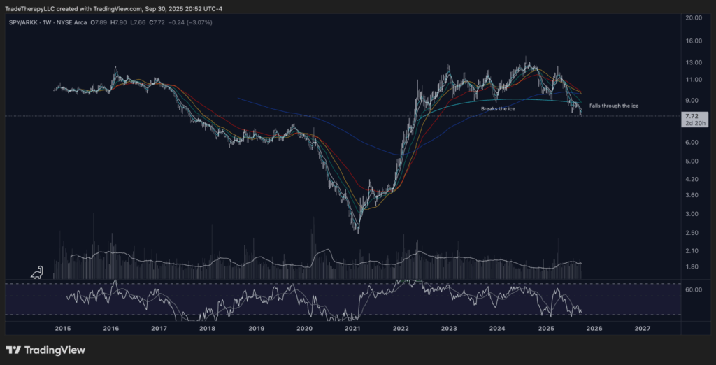
📊 Chart 8 – SPY/ARKK Ratio (September 2025): Innovation Rotation in Focus
The SPY/ARKK ratio lays out the story in one picture. After years of relentless outperformance by the broad market, the ratio is finally breaking down. The move resembles prior cycle turns, where capital flowed back into innovation and high-beta growth.
The structure is clear. The ratio broke through its long-term support earlier this year, retested it, and has now fallen decisively through the ice. That pattern echoes 2016 and 2020, both periods when institutions reweighted toward innovation after long stretches of underperformance.
For traders, this ratio matters more than any single breakout. It shows how institutions are managing the supply and demand of risk itself. When SPY outperforms, capital is anchored in safety. When ARKK begins to catch relative bids, institutions are allocating to higher-beta names, preparing for the next phase of markup.
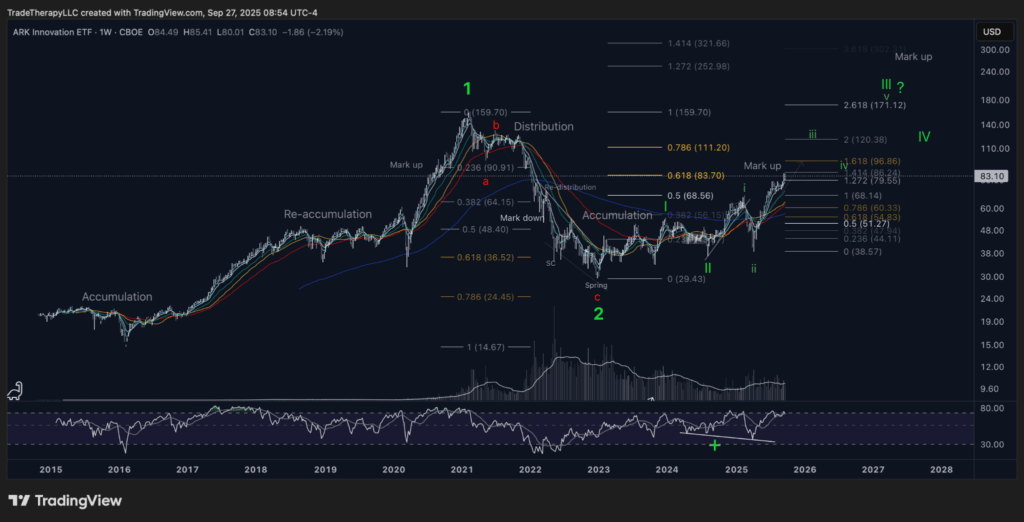
📊 Chart 9 – ARKK (September 2025): Growth Campaign in Motion
ARKK is the aggregate expression of the growth complex. Where single names may offer flashes of strength or weakness, ARKK shows the institutional campaign as a whole. The chart confirms that the sector is no longer debating whether accumulation is complete. That phase ended months ago. The real story now is execution.
The spring of 2023 established the base. Throughout 2024, supply was absorbed in a stair-step accumulation range. With EMAs now fanning higher and markup impulses advancing, ARKK has transitioned into a managed campaign. Institutions are pressing exposure into confirmed demand zones, recycling capital into innovation names as part of a coordinated rotation. The fib roadmap is clear, with local targets at 96.86 and 111.20, the ATH pivot at 159.70, and an eventual 1.618 extension near 171.12.
What looks to retail like “fragile progress” is anything but. Even the potential for a wave c pullback is part of the rhythm. Institutions are not surprised by retracements, they are using them as reloading zones inside the structure they engineered. That is why ARKK is such a powerful read: it embodies the shift from skepticism to sponsorship, from preparation into markup.
💡 What This Means To You
The challenge is psychological. Most retail traders chase strength once it looks safe, or wait for headlines to validate moves already in progress. The institutional edge is different. Professionals scale when demand proves control over supply, even while charts still feel messy. ARKK today is the real-time lesson. It is not about calling the top, it is about recognizing where institutions are already pressing campaigns and aligning with them.
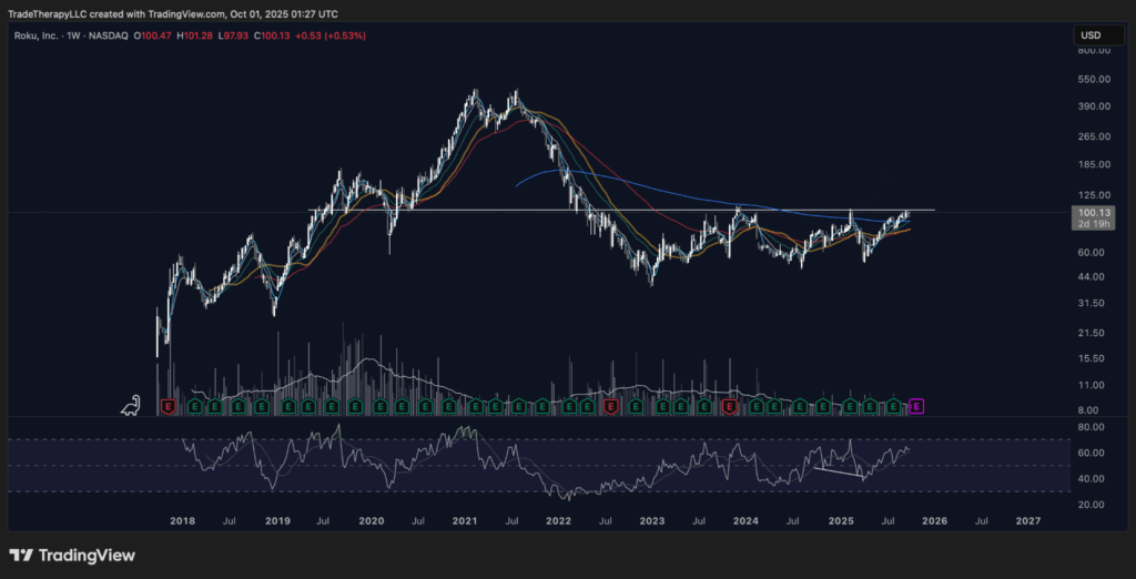
📊 Chart 10 – ROKU (September 2025): Testing the All-Time Pivot
ROKU sits at one of the most important levels on its chart: the all-time pivot zone. After a brutal markdown from the 2021 highs, price spent nearly two years building a wide accumulation range. Volume patterns confirm that institutions absorbed supply while retail abandoned the name, leaving it stranded in the innovation complex.
Now, ROKU is pressing directly into its structural ceiling. The EMAs have turned supportive, RSI has stair-stepped higher, and demand has proven strong enough to hold each retest of the base. To retail, this looks like an obvious breakout trade. To institutions, it is still a stress test. They are probing liquidity at the pivot, making sure that fresh buyers will support the next leg before committing to a full markup.
This is how campaigns are managed in the calm. The eye of the storm is not about safety, it is about preparation. If ROKU clears and holds this level, it validates years of absorption and transitions into markup. If it stalls, institutions have already mapped the base and will use weakness to reload. Either outcome reinforces that this is no longer a forgotten name. It has re-entered the institutional playbook.
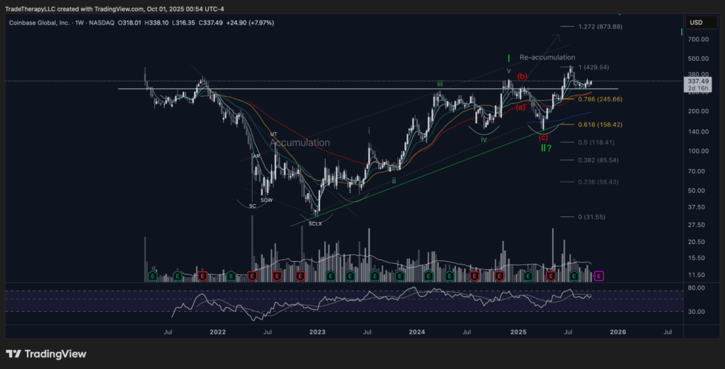
📊 Chart 11 – COIN (September 2025): From Accumulation to Re-Accumulation
Coinbase has completed one of the clearest Wyckoff progressions of the post-COVID era. The 2022–2023 base featured a clean selling climax, automatic rally, secondary test, and spring. Institutions used that volatility to accumulate, then drove the first major markup leg into 2024.
Now the story has shifted. Instead of unraveling, COIN has formed a controlled re-accumulation structure beneath resistance around $430. The corrective wave into mid-2025 tested demand and confirmed higher lows, with RSI maintaining its uptrend. Volume shows that supply has been absorbed, positioning the stock for another markup leg once demand fully regains control.
This is how institutions manage high-volatility names during easing cycles. Retail sees chaos, institutions see campaign structure. Each wide swing provides liquidity to reset positions, reload inventory, and prepare for the next leg higher. The calm of September makes this process look muted, but the re-accumulation base signals that COIN is no longer about survival. It is about preparation for the next advance.
📚 Institutional Literacy: How Innovation Campaigns Are Built
Innovation sectors rarely move in isolation. Institutions build them as campaigns, layering exposure from ETFs like ARKK into single names such as ROKU and COIN. Each stage has a purpose: ARKK reflects the sector transition into markup, ROKU demonstrates how demand is tested at critical pivots, and COIN shows how volatility is engineered into re-accumulation ranges.
To retail, these swings look messy or random. To professionals, they are deliberate. Each pullback creates liquidity, each shelf provides a reload, and each pivot confirms whether demand is strong enough to support the next markup. The eye of the storm provides the cover for these moves to develop quietly. By the time headlines recognize it, the campaigns are already in motion.
Final Thoughts – Trading the Eye
September’s calm is deceptive. Rate cuts delivered relief on the surface, but the charts show what professionals already know: this is not the end of the storm. It is the eye.
The institutional business cycle reveals how the calm is engineered. SPY holds steady while small caps like IWM are stress-tested, and the IWM/SPY ratio echoes the turning point of 2020. The curve shows the same pattern: scars at the short end, testing in the belly, asymmetry waiting at the long end, and TNX confirming that yields are rolling over after distribution. Supply and demand in innovation names add the final piece: ARKK has shifted into execution, ROKU is pressing its pivot, and COIN is re-accumulating beneath resistance.
The lesson is not that the storm has passed. It is that institutions are using the calm to reset campaigns, ration risk, and seed the next leg of markup. To retail, this moment feels like safety. To institutions, it is preparation.
What happens when the winds return will depend on the positions built right now. The eye of the storm is not a pause to relax. It is the moment to read the cycle with discipline, align with institutional footprints, and prepare to trade the next advance with clarity.
Want the deeper dive?
FTTC is free because we want traders thinking bigger, but Clarity is where we map every move with precision. Every week, Clarity zeroes in on a featured spotlight ticker, builds a top‑down view of the broader market, rotating roughly 35-50 stocks, ETFs, crypto, and indices in total.
This week marks the 61st edition — more than sixty straight weeks of institutional‑grade analysis built for traders who want to trade the cycle, not the headlines.
👉 Check out Clarity here — and start trading the cycle with the same patience and intent as the institutions who control it.
Disclaimer: Trade Therapy, L.L.C. content is intended for US recipients only. Our information and analysis do not constitute an offer or solicitation to buy any security and are not intended as investment advice. Content should be used alongside thorough due diligence and other sources. Opinions and analyses are those of the author at the time of publication and may change without notice. Trade Therapy, L.L.C. and its employees may move in or out of any trades detailed within our content at any time at their discretion. Employees and affiliates of companies mentioned may be customers of Trade Therapy, L.L.C. We strive for transparency and independence, and we believe our material does not present a conflict of interest. All content is for educational purposes only.
Headlines used for educational analysis under fair use; all rights reserved by original publishers