
What’s going on?
It really feels like we’ve fallen off the wagon. We had everything all planned out and things were going so well, then this. I’m not even sure where to start.
The Siren’s Call: Unmasking Institutional Manipulation in the Tariff-Driven Market
In the ever-evolving landscape of global finance, market participants are constantly navigating a sea of information, seeking to discern signals from noise. However, beneath the surface of seemingly rational market movements lies a complex web of institutional strategies, often designed to exploit the vulnerabilities of retail investors. This article delves into the concept of the ‘Siren’s Call,’ a manipulative tactic employed by institutions to lure unsuspecting traders into perilous positions. We will examine how the recent tariff policy has created an environment ripe for such manipulation, focusing on the interconnectedness of key financial instruments.
The Influence of Institutional Tactics and Market Narratives
The market is a complex arena where various forces interact to influence price movements. While fundamental analysis and economic data play a role, it’s crucial to acknowledge the impact of institutional strategies and market narratives.
In mythology, Sirens were creatures whose enchanting songs lured sailors to their doom. This metaphor highlights how, in the financial world, market narratives and media headlines can attract investors with seemingly promising opportunities or warn them of impending danger. However, these narratives are not always what they seem.
Institutions, with their vast resources and sophisticated tools, often use market narratives to manipulate investor sentiment and create favorable conditions for their trading activities. They may amplify positive news to fuel buying frenzies or spread fear-inducing headlines to trigger sell-offs, all to their advantage.

Institutional Strategies in Action: A Deeper Look at SPY, QQQ, and IWM
Let’s begin with SPDR’s S&P 500 ETF (SPY). Market narratives often significantly influence investor sentiment towards the overall market. For instance, recent headlines focusing on negative economic data or recession fears can create a powerful influence on investor behavior. Consider these examples (hypothetical):
“U.S. GDP Growth Slows Sharply in Q4, Raising Recession Concerns”
“Yield Curve Inversion Deepens, Signaling Increased Recession Risk”
“Jobless Claims Rise to Highest Level in Two Years, Pointing to Labor Market Weakness”
Such headlines amplify the perception of impending doom, potentially leading investors to sell their SPY holdings or even short the index. However, it’s crucial to look beyond the headlines. Institutions might be using this very negativity to re-accumulate SPY at lower prices, strategically setting the stage for a future rally. To discern the true intent, we must contrast these narratives with the actual price action and volume patterns. For example, even amidst recessionary fears, if we observe the SPY holding support and volume increasing on up days, it could indicate institutional buying despite the prevailing negative sentiment. Furthermore, the SPY chart itself can offer valuable clues.

While the market may exhibit a bullish trend, short-term pullbacks or consolidation are expected. Recent price action might suggest such a pullback, with the price retreating from recent highs and indicators like the RSI moving out of overbought territory. It’s essential to remember that while the price remains above key levels like the 200-week exponential moving average (WEMA), a degree of caution is warranted, as prices that become too extended from longer-term moving averages often precede periods of consolidation. The chart may also highlight other factors, such as yield curve inversions, which, while often cited as recessionary indicators, must be interpreted within the context of overall market dynamics.
It’s important to note, we do see elevated volume levels. However, we’re seeing it at the all time support line which is where volume is supposed to come in. Institutions are not in the business of dumping their positions at the all time demand line. So far, what we’re seeing is not indicative of distribution.

Invesco’s QQQ Trust (QQQ), representing the tech sector, is equally susceptible to the influence of market narratives, albeit with its own unique flavor. Here, these narratives often revolve around tech sector volatility and the hype surrounding emerging technologies like AI. Consider these examples (hypothetical):
“Tech Stocks Tumble as Investors Question AI Valuations”
“Nasdaq 100 Plunges on Renewed Inflation Fears”
“AI Mania Drives Nvidia to New Highs, But Is It Sustainable?”
These headlines illustrate the potential for both euphoria and fear to drive investor behavior in the tech sector. Headlines promoting AI breakthroughs can create a “fear of missing out” (FOMO) effect, driving investors to buy QQQ at potentially inflated prices. Conversely, headlines warning of tech stock sell-offs or valuation bubbles can trigger panic selling. In both scenarios, institutions can capitalize on the resulting market volatility. To navigate this complex landscape, we must analyze the QQQ chart in conjunction with these headlines, carefully observing how trading patterns and volume respond. For example, a sharp sell-off on high volume following a negative headline might indicate institutional selling, while a period of accumulation after a sell-off could suggest that institutions are strategically buying. The Nasdaq’s price action, like the SPY, provides valuable context. The fact that it remains comfortably above the crucial 200WEMA (not shown) confirms the long-term bullish trend. Institutions closely monitor this WEMA as a significant support level, and potential buying activity can be anticipated as the price approaches it, with institutions capitalizing on the opportunity to accumulate shares at lower prices. Indicators like the Relative Strength Index (RSI) also offer insights, revealing instances where the Nasdaq may have ventured into overbought territory, followed by a pullback.
We’ve been discussing the re-accumulation expectations in mega cap tech since last summer. This month’s candle is typical of late stage accumulation and looks very similar to the price action we saw July-August 2024. Notice the similarities in the volume structures (volume bars at the bottom).
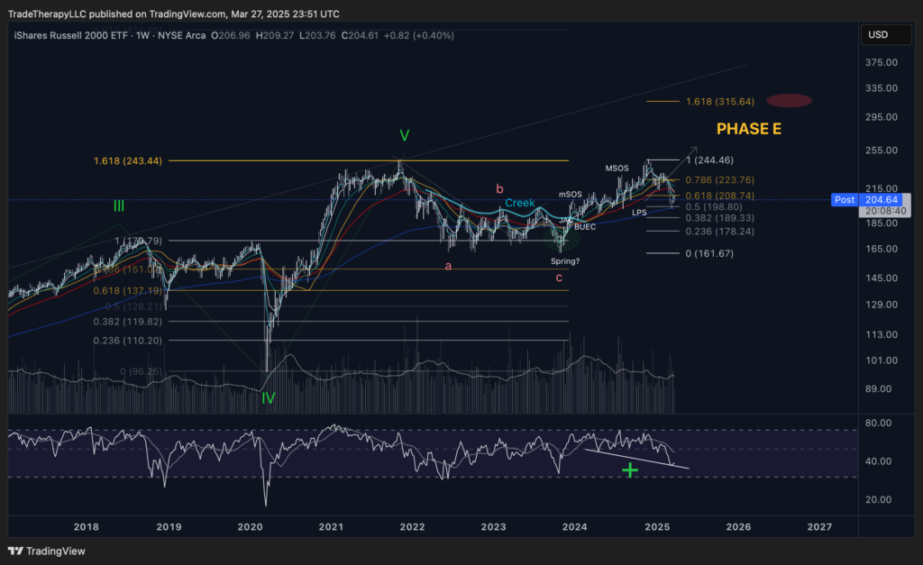
Finally, let’s examine the IWM, representing small-cap stocks. This segment is particularly vulnerable to the influence of economic pessimism. For the past 3 years, we’ve been bombarded with negative headlines warning of an impending recession:
“U.S. GDP Growth Slows Sharply in Q4, Raising Recession Concerns”
“Yield Curve Inversion Deepens, Signaling Increased Recession Risk”
“Jobless Claims Rise to Highest Level in Two Years, Pointing to Labor Market Weakness”
These headlines amplify the perception of market weakness, creating a narrative that suggests dire economic conditions are imminent. This can lead investors to believe that small-cap stocks, often perceived as more sensitive to economic downturns, are particularly vulnerable. However, it’s crucial to remember that while these recessionary fears have been prevalent, certain market segments, such as the S&P 500, driven by mega-cap tech stocks, have continued their upward trajectory. This divergence highlights how media narratives can create a distorted view of the market, and institutions, with their access to advanced information and analytical tools, may be able to see beyond these narratives and capitalize on opportunities that retail investors miss.
In the case of IWM, the extended “Drawback” we’ve observed, combined with the constant drumbeat of recession fears, creates a powerful influence that could be misleading many investors. Institutions may be using this narrative to accumulate small-cap stocks at discounted prices, recognizing their potential for significant gains when the economic outlook improves, or when the market breadth expands. As can be seen in this current IWM chart (above), we observe that the “Drawback,” which we previously identified as the handle of a massive cup and handle pattern, has extended lower than most would have anticipated. This extended drawdown is a classic example of late-stage re-accumulation tactics employed by institutions. By pushing the price low enough to make most investors believe the trade is breaking down, institutions can accumulate shares at significantly discounted prices, effectively shaking out weaker hands and maximizing their position. This extended “Drawback” can lure in bearish sentiment and convince investors that the IWM’s potential recovery is a false hope. The prevailing narrative becomes one of impending doom, with headlines and analysts predicting further declines. However, beneath this surface of negativity, institutions are strategically positioning themselves for the next leg up, capitalizing on the fear and uncertainty they’ve created. The key levels to watch during this extended “Drawback” are the support zones and potential reversal points. High volume on the downswings, particularly near these support zones, could indicate institutional accumulation. Conversely, low volume on the downswings, coupled with a sudden surge in volume on a breakout above key resistance levels, would confirm the potential trend reversal.
The “Creek” and “Spring” annotations on the chart remain relevant, as they highlight potential Wyckoffian patterns that institutions use to manipulate price action and accumulate shares. The 1.618 Fibonacci extension level, which we identified in previous analysis, remains a crucial price target. If the IWM breaks above this level on high volume, it would confirm the completion of the re-accumulation phase and signal a potential for significant upside. However, until then, investors should remain cautious and resist the influence of bearish sentiment, focusing instead on the underlying institutional activity and potential for a trend reversal. In conclusion, the IWM’s current price action, with its extended “Drawback” and potential cup and handle formation, highlights the importance of understanding institutional tactics used throughout their business cycles and resisting market narratives. By analyzing the chart’s key levels, volume patterns, and Wyckoffian patterns, we can gain a clearer picture of the IWM’s potential trajectory and make more informed trading decisions.
How is that affecting things?
It feels like I’m not sure if I’m coming or going. I keep thinking I’ve got it all figured out then something new seems to come out of nowhere and we’re starting all over again.
The recent tariff policy has introduced significant volatility into the market, and its impact is clearly reflected in the US Dollar Index (DXY). As we examine the DXY chart, we observe a complex interplay of technical patterns and institutional activity.

Looking at the multi-year timeframe, we can see a clear distribution phase in late 2022 and early 2023, followed by a re-distribution phase in mid-2023. This suggests that institutions have been actively managing their positions, potentially preparing for a significant market shift.
The most prominent feature of the current chart is the symmetrical triangle pattern. These patterns are common in times of uncertainty as Wall St. works both sides of the trade moving DXY as necessary to support their desired narrative. As we’ve discussed before in FTTC, as interest rates fall, so should DXY. The chart projects a decline towards the 0.236 Fibonacci retracement level at approximately $102.571, and potentially further to the 0.382 level at approximately $95.80 as monetary policy continues to ease.
This potential decline in the DXY is significant, especially in light of the tariff policy. Institutions may be using the policy’s uncertainty to create a deceptive strategy, luring retail investors into long dollar positions before initiating a sharp reversal.
The high volume observed during the distribution and re-distribution phases indicates strong institutional activity. They have been selling into the rallies, creating the illusion of continued dollar strength. Now, as DXY approaches the critical support levels identified by the Fibonacci retracements, we could see a rapid decline.
Institutions may be using the narrative of the tariffs causing inflation, to push retail investors into long dollar positions. When in reality they are preparing for a dollar decline.
We need to closely monitor the following:
- DXY: Pay close attention to the price action as it approaches the 102.571 and 95.800 levels. A break below these levels, accompanied by high volume, would confirm the bearish scenario.
- TNX and IEF: Track the yield curve’s movements. A steepening curve, followed by a rapid inversion, could signal the institutional trap being set.
- Volume: Analyze market activity to identify institutional activity. High volume during breakouts and breakdowns is crucial.
By combining the DXY chart analysis with the understanding of institutional strategies, we can better anticipate market moves and avoid this deceptive strategy.

As we analyze the 10Y Treasury Note Yield (TNX) chart, we can observe a clear “Mark up” phase, followed by a potential “Mark down” phase. The Elliott Wave analysis indicates a potential “b” wave completing, suggesting a potential decline in yields. Furthermore, the moving averages have rolled over and are now acting as resistance, reinforcing this bearish outlook. The zoomed insert in the lower right of the chart highlights this resistance.
The Fed’s recent announcement regarding the reduction in the pace of quantitative tightening (QT) has profound implications for the Treasury market. As reported by Reuters on March 19, 2025, ‘the monthly cap of Treasuries that will be allowed to mature and not be replaced will be ratcheted down to $5 billion per month from the prior $25 billion monthly cap, effective on April 1.’
This reduction means that $20 billion per month of upward pressure on TNX, which previously had to be absorbed by the private sector, will now be significantly alleviated. This is a crucial factor in understanding why the 10-year Treasury yield (TNX) has remained at such elevated levels.

Now, let’s examine the IEF monthly chart. We observe a compelling setup: an inverted head and shoulders pattern, a bullish reversal signal, accompanied by a significant increase in volume. Moreover, the 55MEMA is crossing below the 200MEMA for the first time, a potentially explosive setup should this level be defended. This technical analysis, combined with the Fed’s easing monetary policy conditions, including the dramatic cutbacks in balance sheet reductions beginning on Tuesday, suggests a potential for a substantial increase in IEF.
To gain a more granular perspective on IEF’s recent price action, let’s examine the daily chart. This will help us to observe the more current price action, and the relationship with the moving averages.

The daily IEF chart reveals a strong upthrust, with the price having already retaken all of the moving averages, which are now upward sloping. This confirms the bullish momentum observed in the monthly chart and suggests that IEF is poised for further upward movement.
Here’s how the Fed’s decision impacts TNX and IEF:
- TNX (10-Year Treasury Note Yield):
- The reduction in QT alleviates a substantial portion of the supply-driven upward pressure on TNX.
- However, the Fed’s language regarding potential rate hikes, coupled with inflation concerns stemming from the tariff policy, continues to exert counteracting upward pressure.
- Therefore, we’re seeing a complex interplay of forces. The reduction in QT should have lowered TNX, but it is being countered by inflation fears.
- Crucially, we should anticipate a potential drop in yields starting April 1st, as the impact of the reduced QT becomes more pronounced. And the technical analysis of the chart supports this potential drop.
- IEF (iShares 7-10 Year Treasury Bond ETF):
- The price of IEF, which moves inversely to TNX, is being affected by these conflicting forces.
- The reduced QT should have increased IEF, but, supposedly, the fear of rate hikes is lowering it.
- This is why we are seeing a strange divergence in the price action of TNX and IEF.
- As the yields drop, we should see IEF increase, and both the monthly and daily IEF charts show a strong possibility of this happening.
Institutions are capitalizing on this uncertainty. They are using the narrative of inflation and potential rate hikes to lure retail investors into short positions in IEF, while simultaneously positioning themselves for a potential reversal. The reduction in QT provides them with a window of opportunity to manipulate the market, before the full effect of the reduction influences the market.
The anticipated drop in yields should be very bullish for interest-rate-sensitive sectors, such as those we have been covering. This potential shift in the bond market could create significant trading opportunities.
To identify this potential institutional trap being set, we need to closely monitor:
- TNX:
- Pay attention to the market activity around key support levels. Any significant volume on pullbacks could indicate institutional distribution.
- We must see how TNX reacts to the April 1st date.
- Watch for a potential drop in yields after April 1st. And observe the moving averages acting as resistance.
- IEF:
- Monitor the price of IEF around key support levels.
- Watch for an increase in IEF after April 1st. Both the monthly and daily charts indicate a very strong possibility of this happening.
- Yield Curve (TNX-IEF Spread):
- Track the yield curve’s movements. A steepening curve followed by a rapid inversion would signal institutional manipulation.
- Watch for the yield curve to begin to flatten, and steepen again.
Here is a great tool from StockCharts to monitor the yield curve.
By incorporating the Reuters article, the TNX chart analysis, the IEF monthly and daily chart analysis, and analyzing these key indicators, we can better understand the institutional strategies at play and protect ourselves from the institutional trap being set in the bond market.
What can we work with?
Well, although it’s been pushed to it’s limits, our plan hasn’t exactly failed. It just hasn’t delivered in the time frame WE wanted. I think we should keep pushing ahead with it even in difficult times.
As we navigate the complexities of the tariff-driven market, several compelling trading opportunities emerge, each reflecting the institutional strategies and market narratives we’ve discussed. Let’s delve into these potential trades, beginning with a look at the treasury bond market, then transitioning to the emerging markets, and finally exploring the precious metals sector.
TMF (Direxion Daily 20+ Year Treasury Bull 3X Shares): A Leveraged Play on Yield Declines
As we’ve analyzed the potential for a decline in yields, TMF emerges as a compelling leveraged play on the treasury bond market. This ETF aims to deliver 3x the daily performance of the ICE U.S. Treasury 20+ Year Bond Index, offering amplified exposure to the anticipated yield decline and a trade we’ve been tracking for about a year now.

Our updated weekly chart reveals a significant development: a Wyckoff spring pattern. This pattern reminds us that predicting its formation is impossible. It hinges on buyers stepping in to shift the supply-demand dynamic, a shift that is now showing signs of materializing.
TMF has grinded along its all-time demand line, a crucial support level that has held firm. The volume profile on the chart is particularly telling, revealing substantial institutional accumulation. This confirms that Wall Street is strategically positioned long in TMF.
The presence of a Wyckoff spring signals a potential bullish reversal, The fact that TMF has held its all-time demand line, despite the prolonged grind, suggests strong underlying buying pressure. Therefore, potential entry points could be identified based on the Wyckoff spring confirmation and a breakout above key resistance levels. Given the leveraged nature of TMF, risk management is paramount, and stop-loss orders should be used to protect against potential downside. TMF directly ties into our analysis of the treasury bond market and the potential decline in yields. It’s a leveraged play that can amplify the gains from the anticipated trend, making it a valuable tool for traders seeking to capitalize on the ‘Siren’s Call’ reversal.
EEM (iShares MSCI Emerging Markets ETF): Riding the Dollar’s Potential Decline
Now, let’s shift our focus to the emerging markets, represented by EEM. Given the potential decline in the US dollar, EEM presents an intriguing trading opportunity.

This weekly chart reveals a crucial technical setup: all the moving averages are bundled and acting as support. This could provide a launchpad for EEM’s upward movement. However, it’s essential to acknowledge that this level could also act as strong resistance should it fail. Given the recent accumulation cycle and the potential for a re-accumulation phase, a breakdown is not our primary expectation.
The chart shows a narrative of easing monetary policy, distribution, tightening monetary policy, accumulation, and now, potentially, re-accumulation. This pattern, coupled with the Fed’s tapering, suggests that institutions are strategically positioning themselves for a potential rally in EEM.
The bundled moving averages suggest strong support, potentially acting as a launchpad for EEM. The recent accumulation and potential re-accumulation cycles indicate institutional interest. Therefore, potential entry points could be identified based on a breakout above key resistance levels. Risk management is crucial due to the volatility of emerging markets. Profit targets should be set considering the inverse relationship between the US dollar and emerging market equities. EEM’s potential is closely tied to the dollar’s trajectory, making it a key play in our analysis of the ‘Siren’s Call’ reversal.
GLD (SPDR Gold Trust): Navigating Monetary Policy Changes
Finally, let’s turn our attention to the precious metals sector, specifically gold, represented by GLD. It’s always interesting during periods of monetary policy change to watch the precious metals, including gold.

The weekly GLD chart shows a climax run as wave 3 completes. While we’re not seeing the volume spikes commonly associated with distribution yet, we are beginning to see higher volumes. The volume profile, however, doesn’t indicate distribution so far. We’ll need to closely monitor how April unfolds as the new Fed policies start to take effect.
The climax run suggests potential for a pullback or consolidation. The increasing volume warrants caution, but the absence of clear distribution signals a need for further observation. Therefore, potential entry points could be identified based on a pullback to key support levels or a breakout above resistance with strong volume confirmation. Risk management is crucial, as gold can be volatile. Profit targets should be aligned with Fibonacci retracement levels and GLD’s performance will be closely tied to the Fed’s policies and the dollar’s trajectory.
Tying it all Together: DXY and the Fed’s Influence
The potential trades in TMF, EEM, and GLD are all interconnected by the overarching influence of the US dollar (DXY) and the Federal Reserve’s monetary policy decisions. The anticipated decline in yields, which underpins the TMF trade, is closely tied to the Fed’s QT reduction and its potential impact on the DXY. A weakening dollar, in turn, strengthens the case for EEM and GLD. Therefore, monitoring the DXY and staying attuned to the Fed’s actions are crucial for navigating these trading opportunities successfully.
By strategically positioning ourselves in TMF, EEM, and GLD, we can capitalize on the potential shifts in the bond, emerging markets, and precious metals sectors, respectively. However, it’s crucial to remember that risk management and due diligence are paramount. Always conduct your own research and consider your individual risk tolerance before making any trading decisions.
Summarizing the Key Insights
This analysis has unveiled the intricate interplay of institutional manipulation, market narratives, and the impact of tariff policies on key financial instruments. We’ve dissected how institutions strategically employ ‘Siren’s Call’ tactics to exploit market vulnerabilities, creating both challenges and opportunities for astute traders. By understanding these dynamics, we can move beyond reactive trading and adopt a more proactive, informed approach.
Final Thoughts
As we move forward, the ability to discern genuine market signals from manipulative noise will be paramount. The insights gleaned from analyzing the DXY, TNX, IEF, and the charts of TMF, EEM, and GLD provide a framework for navigating the complexities of the current environment. However, continuous monitoring, adaptation, and a commitment to risk management remain essential for success.
Our message board is live! Look for ‘Topics’ in the header/menu.
2 responses to “The Siren’s Call”
-

In your disclosure in the Feb FTTC you were long TMF and this month you have no current position in TMF. Is this change correct?
-
That is correct but only because we rotated to an immediate opportunity. I believe I mentioned we’ve added to our TSLA/TSLL position to take advantage of this immediate opportunity. Certainly nothing wrong with TMF and likely rotating back shortly. Just taking advantage of the opportunities presented. Obviously, still very bullish on TMF.
We just launched our message board btw. See ‘Topics’ on our header.
-
Disclaimer: Trade Therapy, L.L.C. content is intended for US recipients only and is not directed at UK recipients. Our information and analysis do not constitute an offer or solicitation to buy any security and are not intended as investment advice. Content should be used alongside thorough due diligence and other sources. Opinions and analyses are those of the author at the time of publication and may change without notice. Trade Therapy, L.L.C. and its employees may move in or out of any trades detailed within our content at any time at their discretion. Employees and affiliates of companies mentioned may be customers of Trade Therapy, L.L.C. We strive for transparency and independence, and we believe our material does not present a conflict of interest. All content is for educational purposes only.
Headlines used for educational analysis under fair use; all rights reserved by original publishers.
Leave a Comment
You must be logged in to post a comment.