
What’s goin’ on?
Things have been good, but the question remains whether it will last.
Market Update and Trade Therapy’s Approach
Since the October 2023 lows, the S&P 500 and Nasdaq 100 have experienced a strong rally. As the retail investment community tries to interpret the latest Federal Reserve statements and the likelihood of the much-publicized recession, the markets have shown significant movement.
We observe extended charts in large-cap technology, including semiconductors. The market expectation is for a pullback in the larger indices, which aligns with seasonality heading into March and April. It’s possible that we could see 2024 lows set for many stocks during this seasonal pullback. This pullback will likely highlight a rotation into higher beta assets, which are the most interest rate-sensitive sectors. We anticipate the Russell 2000 (IWM) to outperform as we approach a potential Fed pivot. A weakening dollar could also lead to a bid in emerging markets.
The “hyper-inflation = hyper rate hike” market hysteria is likely in its final stage. We continue to see dramatic downside moves in higher beta assets, signaling a trend change. These wild price swings are designed to trigger stop losses and push retail traders out of their positions. Institutional money is accumulating positions and preparing for their markup campaigns. A markup campaign is essentially an uptrend, where investment firms hold full positions acquired during oversold conditions. These conditions typically arise during periods of panic fueled by alarming headlines. Once firms have a full inventory, they initiate a coordinated campaign to move prices up, including price management, social marketing, favorable analyst opinions, and a positive narrative. Headlines shift from scary to hopeful, drawing investors into the upward momentum.
At Trade Therapy, our goal is to empower our members to identify these conditions. We will continue to cover institutional buying and selling behavior until it becomes second nature to our members. Ideally, after a cycle or two, our members will no longer need us. They will be able to review the data and uncover what is really happening in the market without being swayed by headlines, enabling them to consistently be on the right side of the trade by aligning with Wall Street, rather than reacting to the latest news like everyone else.
Below is a graphic of the business cycle of any tradable asset. We will reference it monthly as we discuss what we’re seeing and how to recognize these patterns. Wealth is generated by stringing together profits from multiple cycles, and it starts by recognizing them.

Welcome to ‘From The Trading Couch’
In this inaugural edition of ‘From The Trading Couch,’ we’ll take a close look at market indicators for interest rates and discuss their impact on professional money-making decisions. We’ll also explore a few examples of the opportunities and pitfalls associated with trend changes.
How is that affecting things?
All I ever hear about are problems. Even if they don’t exist! It’s ‘what if this happens?’ or ‘what if that happens.’ I can’t take much more of this.
Economic Paradox Post-COVID: Good News is Bad News
Since emerging from the COVID lockdown, good economic data has been interpreted as bad. Unemployment numbers are at historic lows, GDP growth is strong, and personal wages are increasing. These are all signs of a healthy, robust economy that would typically be viewed as extremely positive. But not in this environment. Why?
All this data indicates that the US consumer has money to spend, which could lead to ongoing inflationary concerns. This, in turn, might prompt the Federal Reserve to continue increasing interest rates, causing the market to keep selling off. So, good news becomes bad news, and it seems like it’s not the right time to enter the market. In fact, it might feel like the time for everyone to get out before things get worse. Our economy is just too good, which is seen as a problem.
Supply-side inflation from the pandemic shutdowns has now evolved into a situation where the US workforce makes too much money and can afford higher prices, which is perceived as negative. Why aren’t we celebrating the end of COVID and the strong economic numbers? Because an economy that runs too hot could create an out-of-control inflationary condition, forcing the Federal Reserve to raise interest rates so high that it could cause a deep recession. Or so we’re told.
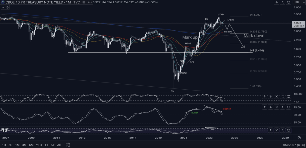
Analysis of 10-Year Treasury Yields
This is the monthly chart for 10-Year Treasury Yields. After the massive COVID dip, there is an equally massive uptrend (markup) period coinciding with the Federal Reserve’s pivot from “inflation is transitory” to “inflation is here to stay” in November 2021. This reflects the fear of rising interest rates, resulting in a violent upswing in yields and tremendous pressure on the stock market.
Theoretically, as bond yields rise, companies looking to raise capital by issuing debt (borrowing from the investment community) in the form of selling bonds will have to pay more because of rising rates. This can impact company profits, which is reflected in lower stock prices.
If we take a close look at this monthly TNX chart, notice the indicators at the bottom. Whenever the price makes higher highs but the indicators make lower highs, it’s known as bearish divergence. This means that although prices are moving up, the momentum is slowing, and there’s a good chance that prices will decline rapidly. Conversely, when prices make lower lows but momentum indicators make higher lows, it’s known as bullish divergence. Prices are dropping, but momentum indicates a rapid increase in price is likely, as seen in April-August 2021 when prices dropped dramatically while the indicators continued to make higher lows. The subsequent rise in bond yields is unprecedented, with no historical comparison.
Fast forward to today, we now see strong bearish divergence. Though continuing rate hikes are prevalent in the media, the subject of Federal Reserve President speeches, and are all the rage in the fintwit universe, notice the head and shoulders pattern forming. This pattern is widely recognized as a classic reversal pattern. Does this mean yields will drop immediately? Not necessarily. However, it does show that the underlying data does not support ongoing rate hikes, regardless of what the talking heads are saying.
Also, remember, financial institutions have social media ‘marketing teams’ whose sole purpose is to perpetuate the narrative that supports their agenda. It’s not difficult to take a very short-term chart and make it look alarming with a dramatic ‘hot take’ comment. The same tactic will be used at the top with very bullish fractal charts creating euphoric buying behavior as the institutions exit their positions. This is all legal and part of how the ‘game’ is played.

Quarterly View of US Government Interest Payments
This is the quarterly view of interest payments by the US Government to service our national debt. Amazingly, this doesn’t seem to be newsworthy. Instead, we hear about the looming deep recession as the Federal Reserve continues to raise interest rates. How much longer can this issue be swept under the rug? If we face continued rising interest rates, how will our government continue to service its debt? Is it reasonable to believe that to recover from supply-side inflation caused by COVID, the Fed will continue raising interest rates, costing our government trillions of dollars, even after the unprecedented period we’ve already seen? The financial media seems to think so.
What does all of this mean? It means that, although we may not see a rate cut anytime soon, the data indicates that financial institutions are already positioning for it. So, we should be as well. This is where ignoring the headlines and focusing exclusively on the data pays off. While the majority still fear the most advertised possible recession ever, those who can read the data will be positioning themselves alongside Wall Street. They never lose.
What can we work with?
I know I need to come up with a plan. Sometimes it just seems impossible to find something that’s working. That I can build on.
Recent Bullish Run in the S&P 500 and Nasdaq 100 (QQQ)
The S&P 500 and Nasdaq 100 (QQQ) have experienced a significant bullish run since bottoming in October 2023. Despite headlines full of dark and gloomy possibilities, such as the government’s need to pass a funding bill to avoid a shutdown, the conflict between Israel and Hamas, the Fed’s inflation alarms threatening continued rate hikes, and the seemingly inevitable recession, the charts tell a different story. Oddly, when you look at the chart (below), you don’t see large volume spikes from institutional selling. Surely, they were just as concerned about all the bad news and would be abandoning their positions to prepare for the horrific economic conditions we were told to expect.

Volume Analysis: Comparing 2008 and 2023
Notice the volume at the bottom of the screen. In 2008, during the Great Financial Crisis, there was legitimate concern about the stability of global markets. Several countries were on the brink of bankruptcy, and the US banking system required a bailout. The large volume spikes (bottom left) indicate real concern, reflecting Wall Street investment firms abandoning their positions. This is what genuine fear looks like.
Now look at the bottom right. Notice the absence of massive volume spikes. If anything, it looks pretty average after the uptick in October 2022 when the market hit its low. That uptick was financial institutions buying the bottom while retail investors were pulling out of the market in anticipation of the expected upcoming recession.
No one batted an eye when zero-day-to-expiry options were introduced roughly a year earlier. Now, major price movements can be achieved using these derivatives without ever selling the underlying position.

SPY has gone on to rally roughly 25% since the October low. Here’s the weekly, reflecting a speculative path with the seasonal pullback previously mentioned.
See why it’s so important to read the data and not listen to the news?
SGML:
It’s imperative to recognize the cycles whether they’re being accumulated or distributed. When something you’re holding has gone on a massive run, it’s critical to remain vigilant. It’s easy to become complacent and/or get lured in by the huge returns that have been generated. Sigma Lithium was one of the up and coming Lithium producers that appeared to be in a great position to take advantage of the strong growth coming out of the EV industry. This demonstrates how important it is to be able to read volume.

This is the all time weekly chart from January ‘23. This parabolic arc pattern is one of the most exciting trades to be in on the way up. It’s also one of the most critical to be able to diagnose and understand. On the way up, demand>supply conditions are clearly present. However, notice the doji candle on the highest weekly volume ever. This is the first sign that institutions are selling their positions. It’s still a white (green) volume candle so it looks like it’s still being bought. It is not. It’s being dumped onto unsuspecting retail investors who probably saw an article or a ‘hot take’ on X (twitter) or a segment on CNBC, etc… This is one of the tactics used by Wall Street to generate exit liquidity. Fast returns with exciting headlines at the top.

Look at the high volume spikes at or near the top. This is a classic sign of distribution and time to either exit or take the short side of the trade. Notice how quickly the demand>supply condition changes to supply>demand. These levels of supply allow for price to quickly drop through perceived support levels. It’s not uncommon for these levels to be backtested as re-distribution forms as retail investors are drawn back in thinking they’ve perfectly timed the bottom. Also, notice the classic top heavy volume profile extending from the left. This indicates how many shares traded hands at each level. This is what retail investors buying the top looks like. Visit the basics for additional resources if you have questions.
Bullish scenario: Buyers step in and provide support at the Base 3 level near the .382 fib retracement at $10.50ish. Even so, this is most likely redistribution forming which should continue lower. At best, it’s most likely just a swing trade opportunity.
Bearish scenario: Primary expectation. Though there may be some relief provided by buyers stepping in, further downside is most likely to be expected. High beta assets that are distributed commonly retrace back to the .618-.786 fibonacci levels. Notice the fibonacci retracement running from all time high to all time low.
HUYA:

HUYA is a Chinese company, backed by Tencent in the live game and entertainment streaming industry. This is another classic example of the business cycle and retail investors being taken advantage of. Again, notice the heavy top shelf of the volume profile. The top formed a re-distribution pattern that appeared to be accumulation. Notice the upthrust in price in February ‘21 on high volume just before the rug is pulled the very next week. Needham’s Analyst put out a buy rating in December ‘19. They reiterated it by maintaining the buy rating in mid August ‘21 after it was clearly marking down. This is a prime example of how risky trading IPOs can be.
After distributing and marking down, HUYA has formed an accumulation range with a series of higher lows. Take note of it’s proximity to the 30 week simple moving average or 30WSMA (gold). Assuming this holds, it should confirm the new uptrend and mark up period.
Bullish scenario: Primary expectation. Demand comes in and establishes a demand>supply condition. This new impulsive structure will develop into wave 3 and see price advance to the first target in the $5.30s. After consolidating briefly allowing the moving averages to catch up, it should move out of the range to $7s before moving on to the 200WEMA (blue) currently at $9.40.
Bearish scenario: This backtest of the moving averages fail as investment firms are still looking to accumulate at the lowest possible price. The downward price structure develops into a larger corrective pattern and tests the local low at $2.15.
Final Thoughts and Risk Management
As always, enter any of these trades at your own risk. Practice strict risk management and maintain a long-term mindset. Understand what the institutions are aiming to achieve and make that your game plan. It may be a rough ride, but it can be very profitable if you keep an eye on the data points we’ve referenced. You’re here, so you’re already ahead of the game.
Disclaimer: Trade Therapy, L.L.C. content is intended for US recipients only and is not directed at UK recipients. Our information and analysis do not constitute an offer or solicitation to buy any security and are not intended as investment advice. Content should be used alongside thorough due diligence and other sources. Opinions and analyses are those of the author at the time of publication and may change without notice. Trade Therapy, L.L.C. and its employees may move in or out of any trades detailed within our content at any time at their discretion. Employees and affiliates of companies mentioned may be customers of Trade Therapy, L.L.C. We strive for transparency and independence, and we believe our material does not present a conflict of interest. All content is for educational purposes only.
Leave a Comment
You must be logged in to post a comment.