Disclosures: This research is for educational purposes only and is not investment advice. Trading involves risk, including the risk of loss. Do your own work and manage risk according to your plan. Positions may change at any time.
Introduction
Nvidia sits at the center of the AI semiconductor complex, but its real value as a case study is behavioral. NVDA is where institutional risk appetite becomes visible because it is liquid enough to scale, crowded enough to expose positioning, and important enough to reflect real sponsorship instead of casual opinion. At its best, it becomes the market’s “Algorithmic Messiah,” not as a slogan, but as a function of how consistently capital flows through it when liquidity conditions support growth.
This report is built around one core question. As monetary policy shifts from restraint toward support, are institutions preparing a renewed campaign in AI leadership, or are they still managing inventory in a late-cycle environment where profit taking, shakeouts, and selective exposure dominate. The point is not to claim a wave three is guaranteed. The point is to evaluate whether the current liquidity path is delivering the ingredients for a wave three style advance: persistent sponsorship, controlled pullbacks that get absorbed, and a complex that rewards leaders rather than punishes them.
Retail often experiences this phase through headlines and emotion. Institutions experience it through inventory, liquidity, and cycle position. That difference in framing is the edge. When a market is transitioning into a more supportive liquidity regime, the tape can look extended and still be early in a new acceleration sequence, because the objective is not comfort, it is positioning.
We will approach NVDA the same way professional desks do, top down. First, confirm whether growth risk appetite is being funded at the index level. Next, validate whether semiconductors are receiving that sponsorship or being treated more cautiously. Then, use peers and leveraged behavior to measure how aggressively institutions are expressing the AI hardware theme. Only after that context is built do we move into NVDA as the centerpiece, and NVDU as a leveraged lens on how risk appetite is being expressed inside the NVDA campaign.
With that framework set, the first step is QQQ.
Lesson of the week
Monetary policy does not just move rates, it changes incentives. When yields fall and the dollar softens, the cost of carrying growth exposure drops, and the reward for holding risk through noise improves. That is when institutions are more willing to add risk back onto their desks, not by chasing headlines, but by rebuilding inventory in the highest signal areas of the market.
Semiconductors and AI tend to sit at the sharp end of that shift. If liquidity is becoming supportive, the playbook usually evolves from defense and recycling to expansion and concentration. Leaders become the preferred vehicle because they offer depth, liquidity, and the ability to express a theme without fighting fills. That is the backdrop that can produce wave three style behavior in a name like NVDA, not because a label must appear, but because conditions can align for sustained sponsorship and accelerating participation.
This is where retail tends to get trapped. Headlines feel like the catalyst, but institutions focus on inventory and cycle position. They care about where supply was absorbed, where liquidity pockets sit, and whether each pullback is being used to reload or to exit. The question to answer is whether the current policy mix is encouraging institutions to press a new campaign in the AI complex, or simply giving them better prices to manage late-cycle risk.
Top Down Analysis
QQQ – Growth risk appetite and the liquidity backdrop
In our last QQQ review, the message was that tech was extended, but it was still being carried as core growth exposure rather than being unwound. The correction did not behave like a completed exit, and the weekly momentum divergence suggested sellers were losing efficiency. That is the context coming into this week. The question now is whether the market is still cooling risk in a controlled way, or whether trimming is starting to harden into a more durable overhead supply problem.
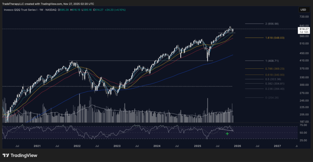
📊 Chart 1 – QQQ (November 2025, Weekly): Bullish divergence at the edge of extension
This chart matters because it showed sellers could push price, but could not drag momentum down with the same force.
After a mature advance, pullbacks often feel violent because the objective is not comfort, it is repositioning. A divergence is valuable here because it hints that the selloff is doing less damage than the headline tape suggests. Price can probe lower, but momentum refuses to confirm, which often means demand is stepping in earlier and supply is being absorbed rather than escalating into a true breakdown. That does not guarantee immediate continuation, but it shifts the burden of proof away from panic distribution.
It also sets a planning concept for newer subscribers. A C leg is the third part of an ABC correction: an initial drop, a reflex bounce, and then a possible deeper leg into a stronger demand shelf. Institutions do not need to predict which path will unfold. They build a map. If price is defended early, they can maintain exposure and add in a disciplined way. If price is allowed to flush, the deeper shelf becomes the preferred reload zone for size.
Now the current analysis begins with the monthly chart.
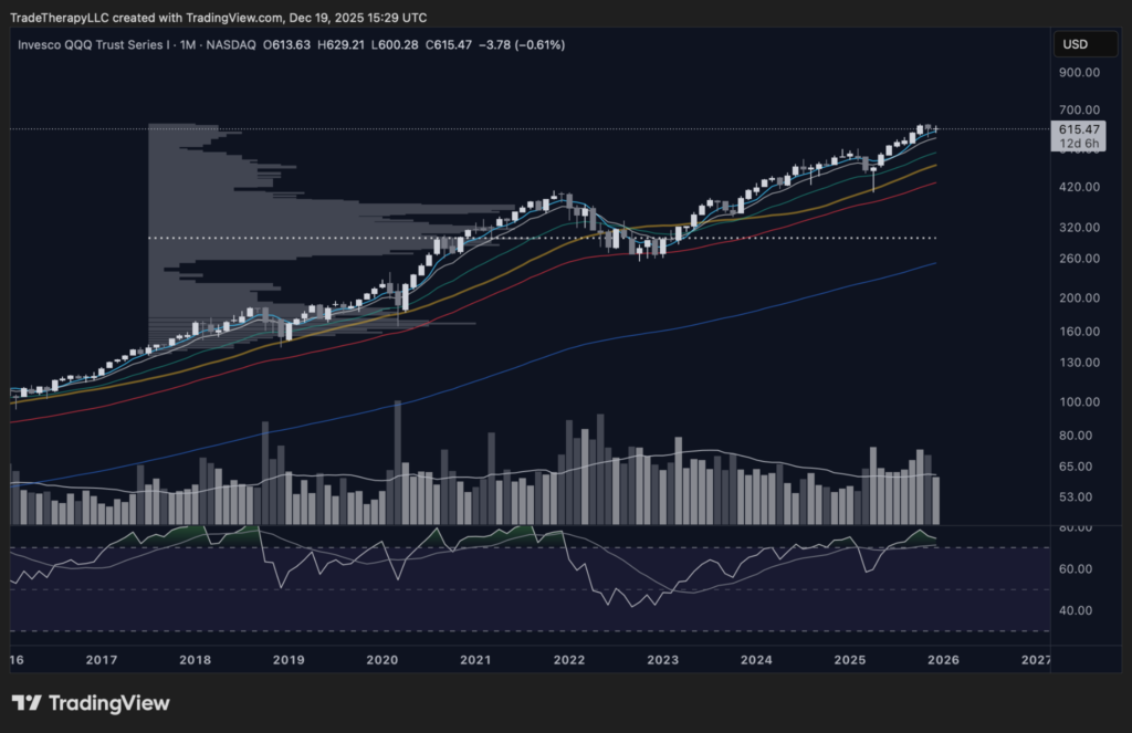
📊 Chart 2 – QQQ (December 2025, Monthly): Extended, but still thin overhead
This chart matters because it tests whether rebalancing is turning into a true distribution ceiling at the highest timeframe.
QQQ is stretched, so harvesting gains is normal. The institutional question is whether that gain harvesting is evolving into an exit process. True distribution usually leaves a heavier footprint near the highs because meaningful selling requires time and repeated two-way trade to transfer holdings without destroying pricing. This profile still looks relatively thin for the level of extension, which leans toward controlled trimming and rotation inside the trend rather than a completed unloading phase.
That distinction is important because a mature advance does not automatically become bearish. In a liquidity environment that is shifting toward support, institutions often prefer to reduce concentration without breaking the broader trend. They scale down into strength, rotate exposure across the complex, then look for better location to rebuild risk. The market typically only shifts into a real distribution regime when behavior changes in a persistent way, such as repeated failures to extend and a thicker overhead shelf that begins to cap every rebound.
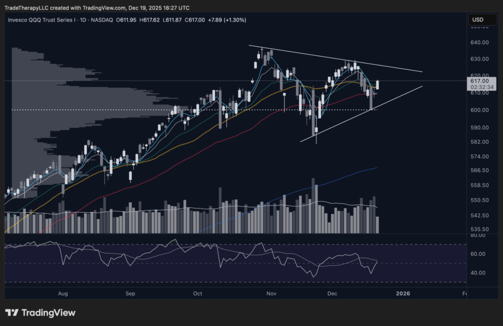
📊 Chart 3 – QQQ (December 2025, Daily): Gaps, absorption, and a defended acceptance zone
This chart matters because it shows how professionals are managing positioning inside the range, not just where price closed.
The daily chart highlights two features that carry institutional information. First, the gaps. Second, the volume shelf and the heavier activity that shows up near the lows.
Gaps are often treated as chaos by retail, but they frequently function as a positioning lever for professionals. When liquidity is thinner and the market is crowded, large players have an incentive to move price through zones quickly rather than negotiate in the open. That fast repricing creates urgency, forces reactive decision-making, and leaves behind reference areas that can be revisited later. Those zones often become important tests, not because every gap must fill, but because institutions prefer to check whether the remaining supply has been cleared before leaning back into risk.
Volume supports that interpretation. Higher participation at the lows is consistent with absorption and defense. When institutions still want the campaign, the busiest business often prints when price is offered, not when sentiment is comfortable. The volume shelf reinforces that there is an accepted zone where institutions are willing to do size, maintain exposure, and stabilize pullbacks without surrendering the larger trend.
The execution question now shifts to the daily timeframe. If institutions are still supporting growth exposure, weakness should continue to attract organized demand, and recoveries should hold rather than repeatedly failing at obvious trend references. If the tape starts selling rebounds back into the shelf and those reclaims keep failing, that is the early warning that the monthly overhead may be starting to build into something heavier.
📦 Institutional Literacy – Why gaps matter in index charts
Gaps can be a fast repricing mechanism and a positioning tool. They move price through low-liquidity areas quickly, force urgency, and leave behind zones that can later be retested to confirm absorption. In healthy advances, gaps often accompany re-risking after a reset. In distribution, gaps more often show up as failed reclaims and fast selloffs that do not recover.
QQQ – Key Takeaways
- QQQ remains extended on the higher timeframe, but the monthly overhead footprint still looks thin relative to the advance, which supports a managed-rebalance read rather than a finished distribution ceiling.
- The prior weekly divergence suggested sellers were losing efficiency, which is more consistent with controlled risk regulation than a regime break.
- The daily gaps and the defended volume shelf read like active positioning and absorption, not panic supply.
- As long as the acceptance zone continues to hold and rebounds do not repeatedly fail, QQQ remains a constructive backdrop for semiconductors and AI leadership.
SMH – Semiconductor sector sponsorship and sector-level intent
📊 Chart 4 – SMH (December 2025, Monthly): Gain harvesting, not a finished exit
This chart matters because the volume profile suggests semiconductors are being managed, not abandoned.
SMH is extended on the monthly, and that is where institutions shift from building exposure to managing exposure. The point is not to argue whether gains are being harvested. That is normal after a strong run. The point is to separate controlled rebalancing inside a broader uptrend from a true distribution process, where large players are working out of positions and leaving behind a heavier ceiling of overhead supply.
The monthly volume profile supports your read. In a genuine distribution phase, the market usually spends more time near the highs, with heavier two-way trade and repeated attempts to push higher that fail. That process builds a thicker overhead footprint because meaningful selling takes time. Here, the profile does not yet advertise a dense ceiling. The cleaner interpretation is that institutions are trimming and rotating while keeping semiconductor exposure involved.
That matters for NVDA because it speaks to how professional money is treating the entire semiconductor complex. If the sector were under broad distribution, leaders would more often behave like liquidity sources, meaning rebounds would be sold, pullbacks would stop getting rescued quickly, and trend support would fail more persistently. A monthly profile that still looks more like managed rebalancing supports the opposite view. Semiconductors remain a place institutions are willing to carry exposure, even if they are doing it with tighter discipline.
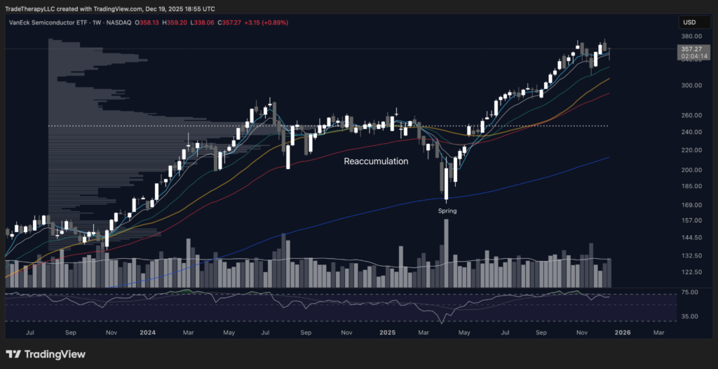
📊 Chart 5 – SMH (December 2025, Weekly): Inventory reset and a clean campaign continuation
This chart matters because it shows the spring-to-reaccumulation sequence that rebuilt positioning before the current advance.
The weekly chart explains how this sector reset before expanding. A spring is a deliberate undercut of support that forces weak inventory out and draws supply into the open, creating a high-quality test of demand. When price snaps back and holds, it signals absorption. That is often the moment the market transitions from stress to rebuilding.
Reaccumulation is the phase where institutions scale back in without chasing. The market goes sideways long enough for size to be built in an organized way, then breaks out when the supply that was available inside the range has been absorbed. That weekly sequence matters because it often produces trend persistence. The sector can keep trending because the campaign is built on positioned exposure, not fragile sentiment.
Now the campaign is later-stage, which changes what to look for. After a strong run, institutions do not need to add aggressively at extension. They want pullbacks that remain controlled, rebounds that hold, and short-term weakness that is met with demand rather than indifference. As long as those behaviours stay intact, the sector’s path is best described as a mature advance being managed, not an exit process taking over.
The top-down implication is straightforward. QQQ suggests growth exposure is still being defended at the index level. SMH suggests that preference is flowing into semiconductors broadly, not just into a single leader. That is the environment where NVDA is more likely to act like the primary vehicle for expressing AI hardware risk, rather than a name institutions use to raise cash.
📦 Cycle Mechanics – Why spring-to-reaccumulation campaigns tend to trend
A spring is not the move, it is the test. It forces supply into the open, then verifies absorption on the reclaim. Reaccumulation is the scaling window that follows, where institutions rebuild exposure without chasing. When that sequence resolves higher, it often produces persistent trend behaviour because the campaign is supported by rebuilt positioning, not by late buyers reacting to headlines.
SMH – Key Takeaways
- The monthly volume profile supports managed gain harvesting and rotation, not a completed distribution ceiling.
- The weekly spring and reaccumulation sequence rebuilt positioning, then resolved into sustained markup, which is classic institutional campaign behaviour.
- The key risk is a persistent shift in behaviour: rebounds that fail more often, pullbacks that stop getting rescued quickly, and heavier supply responses that begin to cap progress.
- With QQQ still constructive, SMH acting well increases the probability that NVDA remains a preferred vehicle for AI hardware exposure.
SOXL/SOXS – The leverage temperature check on semiconductor risk
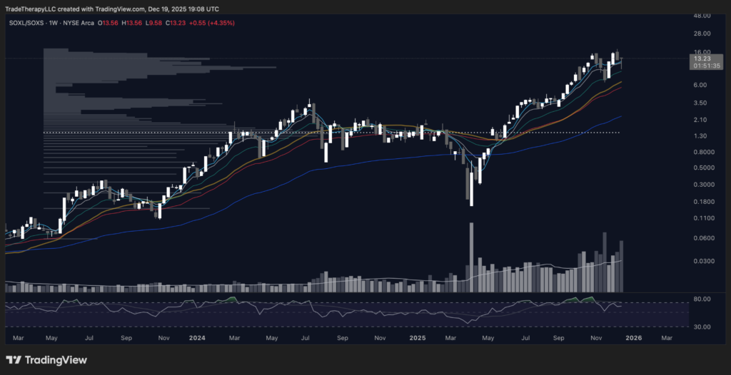
📊 Chart 6 – SOXL/SOXS (December 2025, Weekly): Aggressive risk expression, confirmed by volume
This chart matters because the ratio and volume trend reveal whether institutions are pressing semiconductor exposure or leaning into hedges.
The SOXL/SOXS ratio is a clean way to measure how aggressively the market is expressing semiconductor risk. When the ratio trends higher, it signals that capital is choosing the long-leverage expression over the inverse hedge. When it chops or rolls over, it usually reflects caution, heavier hedge demand, or a market that is still regulating risk instead of expanding it.
Volume is the tell. The biggest participation printed at the stress point, then activity stayed elevated as the ratio advanced. That sequence often marks a reset followed by re-risking. The stress point flushes weak positioning and forces hedges on, then the reversal tells you those hedges are being reduced while long exposure is rebuilt. Institutions may not hold SOXL as a core position, but the ratio captures the net outcome of positioning and protection demand across the complex. When the market is truly leaning into semiconductors, leverage becomes a preferred expression because it delivers more exposure with less capital and can be scaled quickly.
The other important read is correlation. This ratio chart is almost a mirror of SMH. That is useful, not redundant. It suggests the sector’s message is not isolated to one product or one chart. The same “reset then trend” posture is visible across the semiconductor complex, which increases confidence that this is broader sector behaviour rather than a single-name phenomenon.
The risk is behavioural, not technical. If down weeks begin attracting heavier volume and the ratio stops recovering quickly, that is often the first sign that hedge demand is returning and risk is being reduced. If pullbacks remain controlled and the ratio holds its rising posture, it signals that semiconductor risk is still being carried with confidence.
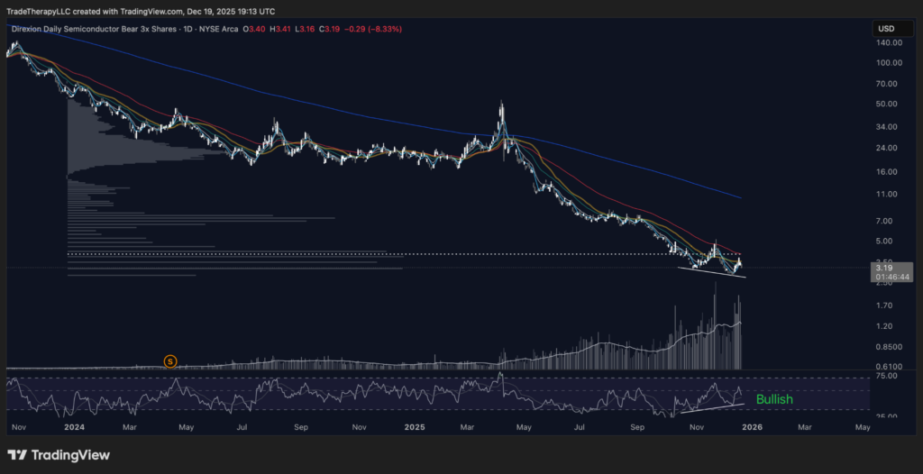
📊 Chart 7 – SOXS (December 2025, Daily): Hedge demand is not sustaining strength
This chart matters because it shows whether the market is paying up for protection or allowing hedges to fade.
SOXS is a hedge proxy for semiconductors. When the market shifts into true risk-off, protection demand tends to stay on, and the inverse product can hold gains, reclaim trend references, and build sustained strength. When risk is being carried, SOXS can spike on shocks, but it struggles to hold those moves and resumes fading.
This chart fits the second profile. The broader posture is still bearish, and recent volatility has not translated into durable trend reversal. Volume has expanded, but heavy activity late in a downtrend often reflects crowded hedging and forced positioning, not the start of a new uptrend. The RSI divergence reinforces that downside force is weakening, which can produce tactical bounces, but unless those bounces reclaim and hold above trend measures, they tend to be countertrend bursts rather than regime change.
That matters because “hedge pressure” is not a feeling, it is a flow. If the hedge vehicle cannot sustain strength while the sector and ratio trend higher, it suggests institutions are not building persistent protection. They are carrying semiconductor exposure, managing it through volatility, and reducing hedges as the trend reasserts itself. That posture is constructive for leaders like NVDA, because leadership tends to strengthen when protection demand is fading rather than building.
📦 Institutional Literacy – Hedge pressure as a positioning signal
Hedge pressure is not fear, it is demand for protection. When institutions expect volatility to expand or trends to break, they buy hedges and keep them on, which shows up as sustained strength in inverse products and repeated failures in the underlying sector. When hedge pressure fades, inverse products stop working. They can still spike, but they fail to hold gains and slide back as protection is reduced. The practical takeaway is simple. If the hedge vehicle is fading while the sector trends, institutions are carrying risk, not running from it.
SOXL/SOXS – Key Takeaways
- A rising SOXL/SOXS ratio reflects a market choosing aggressive semiconductor exposure over hedging, which supports a risk-on posture in the complex.
- Elevated participation at the stress point followed by continued activity during the advance fits a reset then re-risking sequence.
- The ratio’s similarity to SMH reinforces that the message is sector-wide, not isolated to one chart.
- SOXS continues to behave like a fading hedge, with spikes that do not become durable strength, suggesting protection demand is not building.
- The main risk signal would be a shift toward heavier volume on down weeks in the ratio, failed recoveries, and sustained strength in SOXS.
AMD – Peer posture, gap mechanics, and how institutions defend higher acceptance
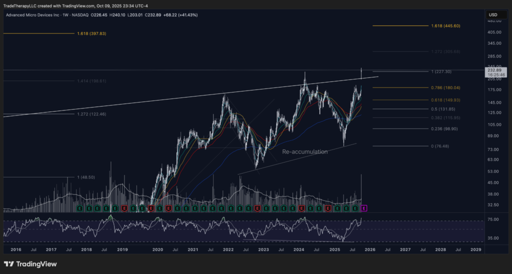
📊 Chart 8 – AMD (October 2025, Weekly): Weekly gap and reset
This chart matters because it shows how institutions can force acceptance higher and then use the gap as a control lever for the next phase of the campaign.
A gap like this changes the negotiation. It relocates AMD from the old battleground into higher ground where prior supply is no longer available at the same scale. That forces anyone leaning the wrong way to respond immediately, and it gives large players a clean reference zone to defend if they want continuation.
The key test is not whether the gap fills. The key test is where acceptance forms relative to the gap and whether participation returns on the next push. In a healthy continuation phase, pullbacks probe into the upper half of the gap and firm quickly. That is how institutions cool a move without surrendering control. They let price check into the gap enough to trigger doubt, then they defend it to keep the campaign intact.
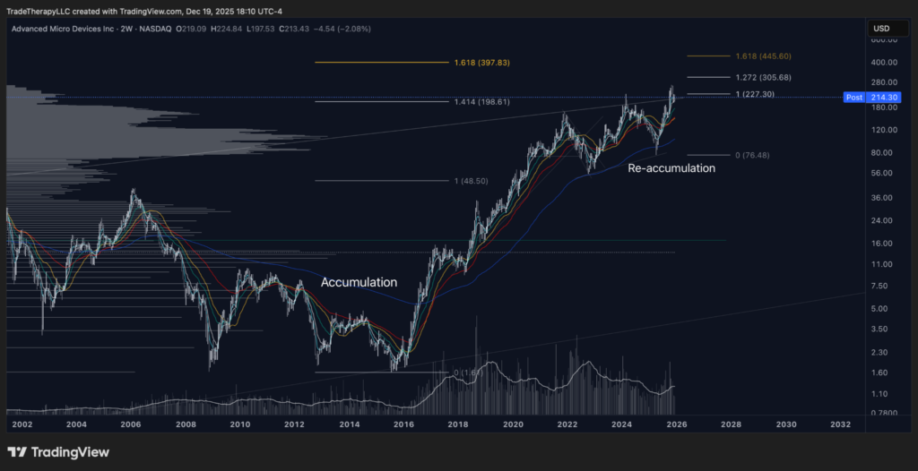
📊 Chart 9 – AMD (December 2025, 2 Week): Reaccumulation resolved, trend carried into higher acceptance
This chart matters because it shows AMD still being treated as repaired leadership, with pullbacks used to regulate risk rather than unwind it.
The current weekly view reinforces why AMD belongs in the top-down chain before NVDA. It is not behaving like a speculative sidecar that only works when sentiment is hot. It is behaving like a rebuilt campaign that institutions are still willing to carry through volatility. The earlier accumulation base established durable ownership, and the reaccumulation phase that followed did its job. It allowed larger players to rebuild size without chasing, then resume markup once supply inside the range was absorbed.
In a monetary regime shifting from restraint toward support, this posture matters. When liquidity conditions improve, institutions often press campaigns that already have repaired structure because they offer clearer risk maps. That makes AMD a useful peer signal. When AMD holds a constructive weekly posture alongside SMH and the leverage read, it reduces concentration risk in the complex. It suggests the theme is being expressed across multiple vehicles, not pinned on a single name.
The warning sign remains behavioral. If the market begins living below its defended shelves and recoveries lose follow-through, that is usually the early signal that the tape is shifting from continuation into a wider consolidation window.
📊 Chart 10 – AMD (December 2025, Daily): Gap as a control zone and a live acceptance test
This chart matters because it shows how institutions use the gap to manage a campaign after the initial impulse.
The daily view makes the institutional plan visible. The gap did what it was designed to do: force a step-change in acceptance, then create a clean zone where price can be worked without returning to the old trouble area. Since then, AMD has not needed to trend vertically to remain healthy. Institutions can keep a campaign intact by controlling where pullbacks stop and how quickly those checks are repaired.
The post-gap behavior reads like controlled regulation, not abandonment. Instead of collapsing back through the gap and erasing the reset, AMD has spent time consolidating and probing the lower edge of the new acceptance area. That is typical when managers are harvesting gains and rebalancing while still keeping the campaign alive. It also creates a clear litmus test. If demand is real, weakness should be met with responsive buying, and rebounds should reclaim key short-term trend references without needing dramatic volume.
This daily structure also helps frame the peer comparison inside the NVDA discussion. When a peer holds a gap-defined acceptance zone and refuses to give it back, it signals that the complex is still being managed as an opportunity set. That raises the probability that renewed liquidity will express itself through leadership continuation rather than a broad unwind.
📘 Institutional Literacy – Gap-over as a control tactic
In crowded markets, a gap over a key trouble zone can be deliberate. It forces repositioning, lifts acceptance to higher ground, and leaves behind a clean reference area institutions can defend to regulate volatility. The follow-through test is not “did the gap fill.” It is whether price holds the upper portion of the gap, whether dips are repaired quickly, and whether the next push recruits participation without the campaign needing constant rescue.
AMD – Key Takeaways
- AMD continues to read like repaired leadership, which supports healthier breadth in the AI semiconductor complex.
- The gap reset is a positioning mechanism: it forces acceptance higher and creates a control zone for managing volatility without surrendering the trend.
- The daily consolidation after the gap fits gain harvesting and risk regulation, as long as price continues to hold its gap-defined acceptance area and dips are repaired promptly.
- If AMD holds firm while SMH and the leverage read remain constructive, it reduces the odds that NVDA is carrying the entire theme alone.
AVGO: A high quality leader deciding between digestion and a deeper reset
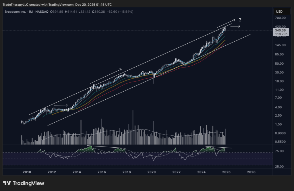
📊 Chart 11 – AVGO (December 2025, Monthly): Mature markup at the edge of long term resistance
A late cycle leader can keep climbing, but it must prove it can convert unrealized gains into stable acceptance instead of forced selling.
AVGO is the type of semiconductor exposure that professional money prefers when policy and liquidity are turning supportive. It has scale, cash flow, and index relevance, which makes it a natural place for institutions to park risk when they want exposure without taking pure single name beta. That preference is visible in the long trend channel and the way price has respected rising moving averages for years. The cost of that success is simple: the longer the campaign runs, the larger the embedded gains become, and the more sensitive positioning gets to any change in liquidity conditions or sector leadership.
That is why the current monthly posture matters. This is not a chart that is screaming breakdown. It looks more like controlled gain harvesting than broad distribution. In true distribution, the tape usually broadcasts repeated failures to sustain progress, failed reclaims, and heavier participation on downswings that overwhelm dip demand. Here, the more important message is that price is pressing into an area where large holders have to make a decision: keep risk on and accept volatility, or cool the campaign and force a deeper rotation of shares. The volume profile helps frame that decision. A wide, well traded profile tends to act like an institutional “work zone” where exposure can be adjusted without destabilizing price. A thin profile near the highs is the opposite. It signals that acceptance is still forming, and that any sharp shift in risk appetite can produce fast travel to the next meaningful demand shelf.
For the broader semiconductor complex, AVGO is a tell. If high quality leadership can digest near highs with orderly behavior, it reinforces the idea that institutions are still comfortable holding semiconductor exposure as liquidity improves. If AVGO begins to lose acceptance and forces a deeper reset, it can validate why hedges are appearing elsewhere. That is the practical link to the SOXS pressure we have been discussing. Hedges tend to show up first when managers are not trying to call a top, but when they are trying to protect a large gain stack while they evaluate whether the next leg higher is ready.
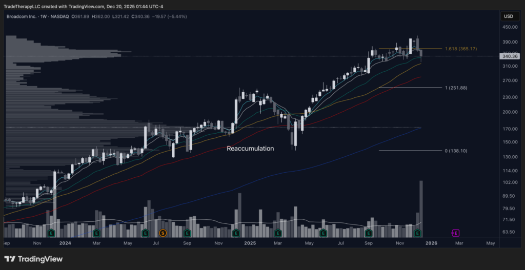
📊 Chart 12 – AVGO (December 2025, Weekly): Reaccumulation resolved, now the trend must prove it can hold higher ground
The weekly chart shows whether institutions are defending the post breakout area as a new base or allowing a wider reset to develop.
The weekly chart frames this as a late cycle advance that already completed a reaccumulation phase and then pushed into a fresh leg higher. That matters because it clarifies what institutions are likely optimizing now. Early in a campaign, they prioritize getting size on. Late in a campaign, they prioritize maintaining control while reducing volatility. When price is extended and gains are large, the job becomes defending the trend without paying up for every incremental high.
The current pullback fits that playbook so far. It reads like a cooling phase where risk is being right sized rather than an unwind where exposure is being abandoned. That is a meaningful distinction for the rest of semiconductors. When AVGO is being treated as a core holding, weakness tends to be contained and organized because institutions have incentive to keep the tape healthy. When AVGO is being treated as a funding source, weakness becomes faster and more emotional because it is liquid enough to raise cash quickly.
A critical behavioral tell is how price behaves around the levels that defined the prior breakout and how it interacts with the moving average stack. The averages are not the thesis. They are a scoreboard. When institutions are defending trend health, pullbacks probe into the support zone, stabilize quickly, and then recruit participation on the next push. When they are allowing a deeper reset, rallies become labored, the short term averages flatten, and the market starts accepting lower.
📊 Chart 13 – AVGO (December 2025, Daily): Event driven break, gap mechanics, and an A–B–C style reset map
The daily chart shows whether the reaction was a one off shock or the first leg of a proportional correction that seeks a deeper demand pocket.
The daily chart is where intent becomes obvious, because the tape shows the exact tool institutions use when they want to change positioning quickly: the gap. A gap is not just a price event. It is a reset of acceptance. It forces fast repricing, it triggers risk controls, and it compresses a multi week repositioning process into a few sessions. That is why gaps often appear near turning points in late cycle leadership. They are efficient. They move inventory from weak hands to strong hands without requiring months of sideways trade.
The key detail is what happens after the gap, not whether it exists. If institutions want this move to remain a controlled digestion, they typically allow a rebound that stabilizes above the most important part of the gap zone and then forms a new balance area with calmer participation. If the rebound cannot hold and participation remains heavy on downswings, it often signals that the gap was the first act of a deeper reset.
This is where the A–B–C framework becomes useful as a probability map, not a prediction. After an event driven break, it is common to see an initial decline, a rebound, and then a final leg that checks a deeper demand pocket. The rebound often retraces roughly 38.2–61.8% of the initial decline, and it frequently does so on lighter volume than the first break because the rebound is more mechanical than conviction driven. A common tendency in A–B–C style corrections is for the final leg, Wave C, to travel roughly a 1.272 multiple of Wave B. That does not make it a guarantee, and it is not a reason to aim at a number. It is a way to map where a deeper demand check often completes, especially when there is an obvious unfinished auction like an earnings gap below. If the rebound stalls in the typical retrace zone and participation stays lighter than the initial break, that is often the market signaling the reset is still in progress and that a proportional Wave C style check into that gap region remains a live path.
For this Clarity issue, that matters because it ties directly into the top down question. If hedges are building in instruments like SOXS while leaders like AVGO are working through post gap digestion, institutions may be trying to hold semiconductor exposure while buying time. If that digestion fails and a deeper check develops, the market is signaling that the sector may need a broader reset before the next sustained push. That is the environment where the leaders, including NVDA, either become the next profit engine or the next funding source depending on how institutions choose to manage risk.
📘Institutional Literacy – Why institutions use gaps to reset positioning
A gap is a control tool. It forces fast repricing, triggers risk limits, and establishes a clean zone where acceptance either forms quickly or fails quickly. The follow through test is not “does it fill,” it is whether the market can stabilize above the gap area and rebuild demand without requiring heavy selling to do it.
AVGO – Key Takeaways
- AVGO remains in a mature markup, which means the dominant risk is not thesis failure, it is how institutions choose to handle a large stack of unrealized gains.
- The monthly profile suggests controlled gain harvesting more than broad distribution, but acceptance near highs still looks thin, which can amplify any shift in risk appetite.
- The weekly chart frames this as late cycle digestion: institutions are likely defending trend health while evaluating whether the next leg is ready.
- The daily gap is the key positioning event. It can resolve as orderly stabilization, or it can become the first step of an A–B–C style reset.
- A Wave C style continuation lower is not guaranteed, but the 1.272 tendency is a useful map for where a deeper demand check often completes, especially when an earnings gap sits below.
- If AVGO stabilizes, it supports the broader semiconductor risk posture. If it cannot, it adds weight to the idea that hedge pressure may reflect more than short term caution.
Top Down Summary
The market is entering a more supportive liquidity phase with growth already positioned on the front foot. QQQ is extended, but it is still being carried with discipline. The tape is not behaving like a broad exit. It is behaving like a mature advance that is being cooled and rebalanced without breaking acceptance. That matters because the AI complex does not need a perfect macro backdrop to run, it needs an environment where institutions can keep risk on without being punished for it. So far, the top-down evidence supports that condition.
Within that index backdrop, semiconductors continue to trade like a sector that is being managed, not reduced. SMH is still holding a constructive posture, and the leverage temperature check agrees. The SOXL/SOXS read is important because it tells us whether institutions are pressing exposure or retreating into protection. The ratio’s behavior, paired with SOXS struggling to sustain strength, suggests hedge demand is present, but it is not gaining control of the tape. This looks more like late-cycle risk management than a full shift into defensive positioning.
The peer layer reinforces that message. AMD continues to read like repaired leadership, with gap behavior that reflects higher acceptance and controlled checks rather than a failed impulse. When peers can hold their footing, it reduces concentration risk and supports trend persistence across the complex. That gives institutions more ways to express AI hardware risk without forcing everything through one name.
AVGO adds the final piece of context. As the quality anchor, it helps separate a normal late-cycle cooling phase from a true shift in behavior. The monthly and weekly posture suggest substantial gains are being managed and resized, but not in a way that resembles broad liquidation. The daily roadmap also reminds readers that event-driven corrections can follow an A–B–C style reset, where a rebound can be part of the process, not proof the reset is finished. The key takeaway is that semiconductors appear to be in a mature phase where hedges and volatility are tools for managing exposure, not evidence that the campaign has ended.
Taken together, the top-down work frames a clean decision tree for NVDA. If QQQ remains stable and semiconductors continue to hold higher acceptance, NVDA has room to act as the primary vehicle for renewed liquidity in AI hardware. If the hedge side begins holding strength and leaders stop repairing pullbacks, the sector is signaling it needs more time, and NVDA becomes the most efficient lever for institutions to reduce risk.
What That Means To You
From a reader’s perspective, the top-down work highlights a key distinction. This is not an early-cycle environment where institutions are trying to discover risk and build fresh exposure from the ground up. This is a management phase where the market is already extended, and professionals are adjusting how risk is carried as policy and liquidity become more supportive. That context changes how to read volatility. Sharp pullbacks and fast recoveries often represent repositioning and risk control, not a broken thesis.
The leverage and hedge signals help clarify that. A rising leverage posture in the ratio, alongside a hedge vehicle that fails to sustain strength, is often what late-cycle continuation looks like. Protection can remain elevated because there are large gains to protect, but the important question is whether that protection starts to dominate price behavior. When it does, rallies fail and acceptance shifts lower. When it does not, hedges tend to spike during stress, then fade as risk is carried forward.
The peer behavior matters for timing. AMD holding its gap-defined acceptance zone and AVGO managing a mature campaign near the highs suggests the complex is still being treated as an opportunity set. That does not remove downside paths, but it raises the probability that pullbacks are still being used to improve location rather than to unwind exposure.
As the focus turns to NVDA, the goal is to use these top-down signals to read whether NVDA is being treated as the profit engine for the next phase of liquidity, a repaired core holding that institutions are willing to carry through noise, or the highest beta lever that gets adjusted first when risk needs to be trimmed. The aim is not to predict a single outcome. It is to recognize which role NVDA is playing, then size and time exposure in a way that matches institutional intent.
Featured Analysis – NVDA
NVDA is where the entire top-down map converges. It sits at the intersection of growth risk appetite, semiconductor positioning, leverage expression, and policy-driven liquidity. The weekly chart will tell us where NVDA is in its current cycle and whether institutions are still defending higher acceptance or requiring more time. The daily chart will tell us how that campaign is being executed, whether pullbacks are being repaired with urgency, and where demand checks are occurring.
In this section, the goal is to answer three questions. First, is NVDA being treated as the market’s primary AI vehicle, with behavior that reflects continued institutional commitment. Second, is NVDA still in a controlled reset where location is being improved before the next sustained push. Third, how does leverage behavior fit into the campaign, which is where the NVDU/NVDQ ratio becomes useful as a real-time read on whether institutions are pressing or regulating NVDA risk.
Where We Left Off: The Campaign That Built The Base For Today’s Risk
📊 Chart 14 – NVDA (August 2025): Mature markup with controlled resets
This weekly view shows the core message institutions care about: NVDA has been in a long-running markup campaign where pullbacks repeatedly resolved into higher acceptance, not breakdown.
The important takeaway from this lookback is not “NVDA is strong.” It is how it has stayed strong. The EMA stack remained constructive for most of the advance, and when price did cool, it did so through controlled time and range work rather than violent liquidation. That is what a professionally managed campaign looks like. The operator allows enough two-way trade to recycle risk, but not enough to damage the broader trend.
That context matters this week because the current setup is not a fresh breakout phase. It is a mature advance that has already produced meaningful distance. In that environment, the next decision point is rarely about “bullish or bearish.” It is about whether institutions can cool the move without losing control, or whether cooling turns into a deeper corrective phase that forces a larger reset.
Current Weekly: Similar Posture To AVGO, With Correction Risk Now On The Table
📊 Chart 15 – NVDA (December 2025): Reaccumulation resolved, now managing mature-trend risk
This weekly chart reads like a campaign that has already achieved a lot of progress and is now deciding how to manage what is left.
Price is still operating above the rising long-term trend measures, and the broader advance remains intact. But the posture is no longer “easy upside.” The chart is starting to show late-stage behavior: momentum is less clean, pushes require more effort, and the tape begins to invite two-way trade near the upper band of the range.
From an institutional lens, this is where you often see the difference between:
- Profit harvesting and controlled cooling (healthy), versus
- A genuine shift into a wider corrective box (messier and slower)
The market does not have to “break” for institutions to be reducing exposure. In mature phases, they often manage risk by encouraging churn: enough dip-buying to maintain confidence, enough pressure to keep late chasers uncomfortable, and enough ambiguity to let them re-balance without creating a panic.
Elliott Wave Overlay: A Practical Map For The Next Reset
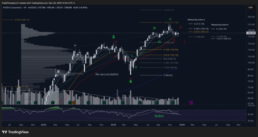
📊 Chart 16 – NVDA (December 2025): Potential Wave 5 completion and ABC corrective path
This is the same technique we used on AVGO, and it fits here because it provides a clean way to frame “cooling” without overreacting.
If the impulsive move is near completion, the most common next phase is an ABC correction, where:
- Wave A establishes the first true sell impulse,
- Wave B retraces a portion of Wave A (often a 0.382–0.618 retrace), and
- Wave C extends lower, frequently behaving like the “liquidity sweep” leg that forces the final reset.
In this chart, Wave B’s typical retrace zone lines up with the mid-180s to mid-190s area, which is why that zone matters. If NVDA rallies into that band on lighter participation and then fails to regain control of its short EMAs, that is often the market telling you the move is a corrective bounce, not a fresh trend resumption.
From there, the Wave C expectation becomes relevant. A common guide is that Wave C will extend beyond the Wave A low, and in many cases a 1.272 extension of Wave B helps frame where that sweep could terminate. On this mapping, that projects to the mid-160s, which would also function as a “clean up” test of the larger base by pressing into obvious liquidation territory before demand can reassert control.
This is not about predicting the future. It is about building a risk map that matches how institutions often run mature campaigns: they allow a correction to do the emotional work for them, then they decide whether the next leg is continuation or a longer digestion phase.
📘 Institutional Literacy
Why Wave C matters to institutions: In mature advances, the hardest part of continuing higher is not finding buyers, it is finding clean inventory to continue the campaign. A Wave C style sweep often functions as a reset tool: it shakes out weak hands, forces hedges to pay up, and tests whether real demand still exists when headlines and sentiment are at their worst.
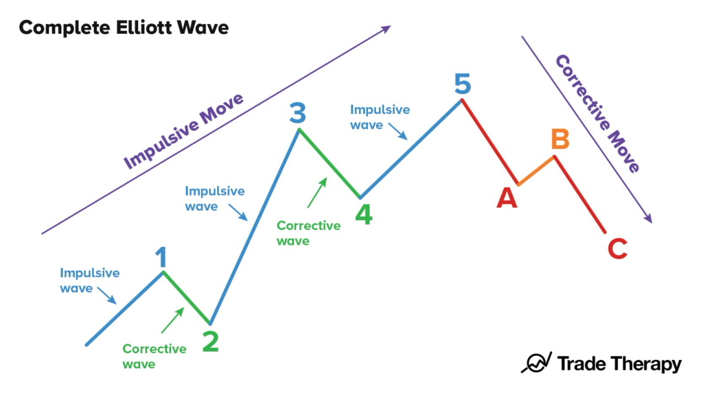
Graphic 1 – Complete Elliott Wave (Impulse + ABC Correction)
NVDU/NVDQ: Leveraged positioning and what “hedge pressure” really means
This is NVDU by NVDQ, long versus short. It is one of the fastest ways to get a clean read on institutional positioning because it strips away the noise of the headline tape and focuses on the leveraged trading environment itself. When this ratio is rising, the long side is in control. When it is falling, hedge pressure is gaining influence.
Disclosure: No current position in NVDU, NVDQ
Video 1 – NVDU/NVDQ Lookback: Profit taking vs distribution
This lookback is invaluable because it teaches the only question that matters when momentum pauses: is leverage being reduced through routine profit taking, or is there evidence of distribution that tends to precede a deeper reset?
In the prior example, the key tell was not that price stopped going up. It was the way it stopped going up. You can see the reaccumulation structure in NVDA with a terminal shakeout, and then you see these unusually high volumes paired with smaller candles. That combination often signals inventory being worked out into strength. Operators are using liquidity to rotate exposure without allowing price to collapse yet. The next risk in that type of tape is a controlled undercut of the range, sweeping liquidity and forcing a deeper reset.
The point is not to turn every pause into a bearish call. The point is to recognize the signature of distribution when it actually shows up. Small candles on heavy volume during a stall usually means something is changing under the hood.
Now compare that to the current setup.
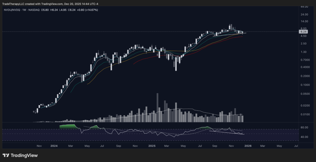
📊 Chart 17 – NVDU/NVDQ (December 2025): Leveraged demand is pausing, not breaking
On the current weekly ratio chart, the primary uptrend is still intact even though momentum has cooled. The short EMA stack is still rising and price is holding above the “floor” those averages provide. That is what you want to see if the pause is digestion rather than damage.
This also looks like the right kind of de-risking. It is a drift and settle, not a hard transfer. Volume matters here because it separates “hedge pressure” from “distribution.” In the lookback, volume was the warning label, heavy participation while progress stalled. Here, volume has not shown the same heavy transfer signature during the stall. That leans this pause toward ordinary gain harvesting, not a meaningful shift in the leveraged regime.
So what is “hedge pressure” in plain terms?
Hedge pressure is when institutions start carrying more downside protection or short exposure to manage a mature advance, even while they maintain a long book. It is not automatically bearish. In fact, early hedge pressure can be supportive because it stabilizes pullbacks and allows managers to stay invested without taking full volatility risk. The risk is when hedge pressure turns from a partial offset into an active headwind. In ratio terms, that transition usually shows up as acceptance below the short EMA stack followed by rebounds that cannot recover it.
What would change the read is straightforward. If the ratio starts living below the short EMA stack and recovery attempts become laboured, that is typically hedge pressure turning into a bigger constraint on upside follow-through. It is not about one red candle. It is about acceptance lower and failed reclaims.
📘 Institutional Literacy
Hedge pressure vs distribution: A hedge is a stabilizer. It rises as a counterweight while the long book is still being carried. Distribution is different. It shows up as heavy-volume transfer while progress stalls, then a loss of support that fails to recover. The ratio chart helps you separate “cooling” from “breaking” before the underlying ticker makes it obvious.
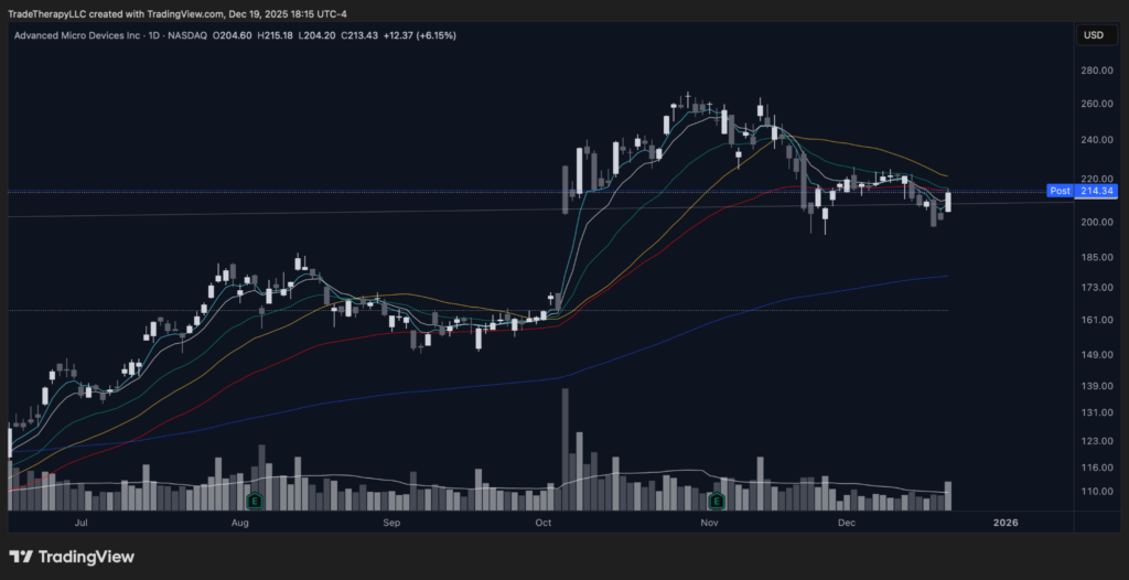
NVDA: The daily chart is the real test of intent
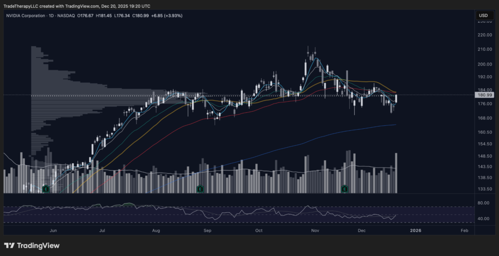
📊 Chart 18 – NVDA (December 2025): Daily acceptance test after the spike
After an impulsive run, the most revealing phase is not the peak, it is the “boring” grind where price decides whether it can hold higher ground.
This daily chart does a good job showing why the weekly can look constructive while the tape still feels messy. The November spike created a new reference point, but the market has not rewarded momentum since. Instead, NVDA has spent weeks chopping around a major acceptance zone, with repeated probes on both sides and quick reversals. That is not “broken.” It is a balancing process where large players decide whether to keep defending the new range, or let price travel lower to reset conditions.
What matters here is where acceptance forms relative to the prior ceiling and the short moving averages:
- If pullbacks keep getting checked quickly and the short EMAs can re-curl, that supports the idea that this is controlled cooling inside a larger uptrend. In that case, the correction we mapped on the weekly is more likely to stay shallow, with time doing more of the work than distance.
- If acceptance starts to live below that zone and the short EMAs lose slope, the market is signalling that the campaign needs a deeper reset. That is where the wave framework becomes useful. “A” already did the damage. “B” is the relief rally attempt. If “B” fails to reclaim and hold, “C” is where liquidity usually gets taken, and it often happens faster than people expect.
This daily also ties back cleanly to what the NVDU/NVDQ ratio is telling us. If leverage appetite is not showing heavy distribution characteristics, then this chop reads more like routine rebalancing after a mature advance, not a full exit. That distinction matters because it changes what you should expect next. A hedge-heavy environment can still create sharp downdrafts, but the base case shifts toward volatility inside a larger range rather than immediate trend failure.
Summary of Featured Analysis – NVDA
NVDA is still the pressure gauge for the entire semiconductor complex, but the bigger message this week is not “NVDA up or down.” It is where leadership sits inside a mature advance. SMH and the SOXL/SOXS ratio show the same core condition: the sector absorbed a violent spring earlier in the year, then transitioned into clean markup that is now being managed near the highs, not chased. That is what late-stage leadership looks like when large players are still committed to the trend, but are also policing risk and reducing volatility exposure.
The NVDA weekly reinforces that posture. The larger reaccumulation structure remains intact, but the tape is no longer in “easy trending” mode. It is in “range management at the top of the campaign,” where the job shifts from pressing to maintaining control. That is why the AVGO comparison matters. When a sector leader and its peers are extended from their base, the next phase often looks like time and digestion, not an immediate reversal. The market’s work becomes deciding whether the pause is a controlled reset that keeps the advance healthy, or the start of a wider corrective process.
That is where the Elliott Wave and fib framework earns its place. It is not there to force a forecast. It is there to map the most common path corrections take when wave 5 is completing or has just completed. In that script, Wave A is the “first break in behaviour,” Wave B is the reflexive recovery that invites buyers back in, and Wave C is the follow-through that tests whether demand is real or only emotional. If the market chooses that path here, the 185–195 area becomes the natural window for a Wave B response, and 164 becomes the logical Wave C destination because it lines up with a full corrective test of the structure’s lower boundary and the most obvious liquidity just beneath it.
The NVDU/NVDQ ratio is the check on whether this is normal cooling versus real distribution pressure. The lookback matters because it shows what distribution actually looks like inside a leveraged environment: big volume, small candles, and repeated failure to reclaim. Compared to that history, the current ratio reads more like controlled rebalancing than panic. If leveraged long versus short positioning holds firm while NVDA chops, that is typically a sign the market is pausing inside the trend, not exiting it.
So the arc into scenarios is simple: semiconductors are still in leadership, but leadership is being managed, not extended. NVDA is in the part of the cycle where traders get punished for treating every pullback as a breakdown, and also punished for assuming every bounce means the correction is over. The job now is to let the tape prove which version we are in.
Bullish Scenario
The bullish version is a correction that stays proportional. That means the market uses time and range, not collapse, to reset conditions. In that case, the best tells are behavioural: pullbacks find buyers quickly, rebounds do not require explosive volume to hold, and the short EMA stack begins to stabilize and re-curl rather than staying pinned downward.
If the wave framework is going to express as “reset then continuation,” it usually shows up as a Wave B response that is clean and believable, not desperate. The 185–195 window is a logical region for that kind of response, and the follow-through you want is simple: acceptance holds above the recent breakdown area, and the market starts to build higher lows that force shorts to cover into strength rather than letting them press into weakness.
Bearish Scenario
The bearish version is not “the trend is dead.” It is that the market chooses a deeper corrective path before the next sustained leg higher. That typically looks like repeated failure to reclaim key overhead zones, rebounds that fade quickly, and an NVDU/NVDQ ratio that starts to weaken as leveraged long positioning gets reduced.
In the wave script, this is where Wave C does the real work. Wave C is often the move that forces late buyers to capitulate and tests the lowest-risk demand area in the structure. The 164 region becomes a logical destination in that case because it represents a full test of the structure’s lower boundary and the most obvious liquidity beneath it. If price pushes into that zone and demand cannot defend it, the market is signalling that NVDA has shifted from “pause in trend” to “wider corrective process,” and time becomes the cost of admission before the next campaign can launch.
Trade Considerations
These are our thoughts on entering or managing our trades at the time of publication and are intended to be educational. Do not consider these considerations to be personal financial advice.
Trade Considerations – QQQ
| Bias | Bullish with mature-trend discipline. Prioritize pullbacks into defended zones over chasing rebounds. |
| Institutional Positioning | Rotation and exposure management, not a broad exit read. The question is whether dips keep getting absorbed inside the acceptance area. |
| Trend Health | Higher timeframe trend remains intact. Near-term health depends on holding the acceptance shelf and avoiding repeated failed reclaims back into it. |
| Entry Levels | Primary: $600-$606 (acceptance shelf). Secondary: $590-$595 (deeper demand check). Tertiary: $575-$582 (bigger reset zone if volatility expands). Continuation: $625-$635. |
| Cascading Stops | Stop 1: below $596–$598 (shelf lost, bounce attempts fail). Stop 2: below $588-$590 (range expands lower, demand no longer controlling the auction). Stop 3: below $574-$576 (deeper demand pocket breaks, requires a broader reset thesis). |
| Rotation Watch | If QQQ starts living below $600 and rebounds keep failing near $617, expect semis and AI leaders to behave more like cash-raise sources. If $600 continues to hold and $617 reclaims stick, leadership concentration usually strengthens again. |
Trade Considerations – SMH
| Bias | Bullish with late-cycle discipline. Let pullbacks come to you. |
| Institutional Positioning | Managed trimming and reload behaviour still reads more likely than liquidation, but maturity means faster shakeouts around obvious levels. |
| Trend Health | Strong on weekly and monthly while price holds above the rising weekly trend measures. Monitor for a shift into repeated failed bounces. |
| Entry Levels | Primary: $345-$352 (first dip-buy zone, near the weekly short-EMA area). Secondary: $330-$336 (deeper weekly shelf). Tertiary: $300-$306 (bigger reset zone, near the 55-week area). Continuation: $360-$366 |
| Cascading Stops | Stop 1: below $340-$342 (short-EMA defence fails). Stop 2: below $324-$328 (weekly shelf breaks, acceptance shifts lower). Stop 3: below $282-$286 (monthly reset signal, aligns with the $283 fib zone on your chart). |
| Rotation Watch | SMH losing $345-$352 and failing to reclaim quickly often shows up as weaker NVDA follow-through. If SMH holds that zone and reclaims remain clean, NVDA and peers tend to keep acting like primary vehicles, not funding sources. |
Trade Considerations – SOXS
| Bias | Hedge thermometer, not a leadership bet. Use it to monitor whether protection demand is sustaining. |
| Institutional Positioning | The key is whether spikes can hold and build higher acceptance, or whether they fade back into the downtrend quickly. |
| Trend Health | Bearish trend remains intact while it stays below the declining averages. Any bounce needs sustained acceptance to matter. |
| Entry Levels | Primary: $3.70-$3.85 reclaim and hold (only if hedge pressure is actually sustaining). Secondary: $3.10-$3.25 (tactical bounce zone, more likely fade unless it reclaims). |
| Cascading Stops | Stop 1: below $3.00-$3.05 (bounce fails quickly). Stop 2: below $2.85-$2.90 (trend resumes lower, protection demand fading). Stop 3: below $2.70-$2.75 (hedge pressure fully unwinds again). |
| Rotation Watch | SOXS holding above $3.70 while SMH weakens is a warning that protection demand is starting to stick. SOXS failing to hold bounces while SMH remains constructive supports the “hedges spike, then fade” interpretation. |
Trade Considerations – AMD
| Bias | Bullish while gap-defined acceptance holds. Prefer adds on controlled weakness, not strength. |
| Institutional Positioning | Repaired campaign still being carried. Watch whether dips get repaired quickly and whether the gap zone remains defended. |
| Trend Health | Constructive while pullbacks remain contained and recoveries reclaim short-term trend references without repeated failures. |
| Entry Levels | Primary: $205-$210 (controlled pullback zone). Secondary: $198-$201 (weekly fib shelf at $198.61, better location). Tertiary: $186-$190 (deeper reset zone if volatility expands). Continuation: $220-$250 |
| Cascading Stops | Stop 1: below $198-$199 (fib shelf fails, acceptance slipping). Stop 2: below $186-$188 (character shifts, correction broadens). Stop 3: below $158-$160 (major shelf breaks, implies a larger reset is underway, gap fill failure). |
| Rotation Watch | AMD holding above $198 while SMH remains constructive supports breadth in the complex. AMD losing $198 and failing to reclaim increases the odds NVDA becomes a funding source during volatility windows. |
Trade Considerations – AVGO
| Bias | Constructive but late-cycle. Treat as digestion unless price proves otherwise. |
| Institutional Positioning | Still reads like managed exposure, but the gap event means you must demand confirmation that stabilisation is real. |
| Trend Health | Higher timeframe trend intact. Near-term health depends on whether the post-gap structure can hold above key retrace zones without repeated heavy sell responses. |
| Entry Levels | Primary: $376-$384 (0.382 stabilization band). Secondary: $352-$356 (0.618, higher-quality location). Tertiary: $320-$325 (1.0, deeper reset completion area). Continuation: $400-$410 (entering price discovery). |
| Cascading Stops | Stop 1: below $368–$372 (first stabilization band breaks). Stop 2: below $346–$350 (0.618 fails, sellers control rebounds). Stop 3: below $298–$302 (1.272 breaks, deeper reset dominates). Optional final line: below $272–$276 (1.618, full washout path). |
| Rotation Watch | If AVGO can stabilize above $376 and rebuild acceptance, it supports the “cooling, not breaking” read. If it loses $352 and cannot reclaim, hedge pressure starts to look less tactical and more structural. |
Trade Considerations – NVDA
| Bias | Bullish long-term, neutral-to-cautious near-term while the corrective process resolves. This is not a chase environment. |
| Institutional Positioning | Weekly still reflects an intact campaign, but behaviour has shifted into exposure management. Expect more shakeouts and two-sided trade around obvious levels. |
| Trend Health | Weekly constructive, daily mixed. Health improves when price can hold above the current acceptance zone and the short EMAs re-curl with clean follow-through. |
| Entry Levels | Primary: $176-$181 (daily acceptance band, tactical adds only if it holds). Secondary: $169-$171 (1.0 corrective zone at $170.20, higher-quality location). Tertiary: $163-$166 (1.272 zone at $164.07, “wave C” completion window). Optional deeper reset: $155-$160 if the correction overshoots and forces a broader time-box. |
| Cascading Stops | Stop 1: below $173–$175 (range support fails, near-term invalidation). Stop 2: below $169–$170 (1.0 fails, correction expanding). Stop 3: below $163–$164 (1.272 fails, deeper reset risk becomes dominant). Optional final line: below $154–$156 (larger campaign damage, likely requires a longer rebuild). |
| Rotation Watch | Confirm NVDA through SMH and SOXL/SOXS (sector appetite) and NVDU/NVDQ (leveraged pressure). If NVDU/NVDQ holds its rising posture while NVDA chops, it supports “normal cooling.” If the ratio loses its short-EMA floor and cannot reclaim, hedge pressure is becoming a real headwind. |
Final Thoughts
This week’s Clarity message is about how leadership behaves when a campaign matures. SMH and the SOXL/SOXS ratio show the same thing: the spring was absorbed, the markup was executed cleanly, and now the sector is in the part of the cycle where institutions manage exposure rather than extend it every week. That is when retail gets most vulnerable, not because the trend is broken, but because the tape becomes choppy enough to punish emotional decisions on both sides.
For NVDA specifically, the weekly still argues for an intact long-term campaign, but the daily confirms the market has shifted into digestion. That is why the Elliott Wave corrective template is useful here. It gives you a framework for what “normal correction” looks like, how Wave B typically behaves, and why Wave C often targets the most obvious liquidity. The point is not to forecast. The point is to stay aligned with what the tape is trying to accomplish so you do not confuse a controlled reset with distribution.
The practical takeaway is simple. Do not chase. Let price prove demand at support, let the ratio charts confirm whether leverage is being reduced or merely rebalanced, and use cascading risk to stay in the campaign without letting normal volatility turn into a portfolio problem.
Lastly, are you interested in being notified about Clarity publications via text instead of email? Let us hear from you in the comments below.
Consulting Hours
10a-2p PDT Mondays & Tuesdays, $150/30 mins. Email: contact@tradetherapyllc.com.
Welcome New Members!
Check The Basics for chart help, welcome aboard!
Video:
Disclaimer: Trade Therapy, L.L.C. content is intended for US recipients only. Our information and analysis do not constitute an offer or solicitation to buy any security and are not intended as investment advice. Content should be used alongside thorough due diligence and other sources. Opinions and analyses are those of the author at the time of publication and may change without notice. Trade Therapy, L.L.C. and its employees may move in or out of any trades detailed within our content at any time at their discretion. Employees and affiliates of companies mentioned may be customers of Trade Therapy, L.L.C. We strive for transparency and independence, and we believe our material does not present a conflict of interest. All content is for educational purposes only.
Headlines used for educational analysis under fair use; all rights reserved by original publishers.
Leave a Comment
You must be logged in to post a comment.